VISUAL IDENTITIES
This page showcases a series of complete visual identities for different enterprises.
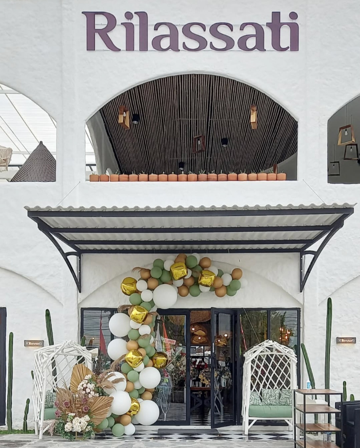
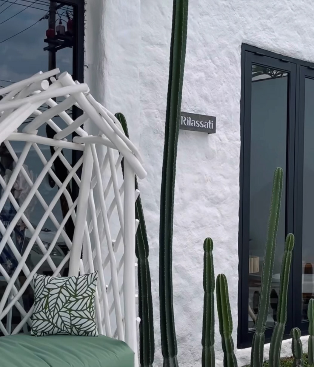
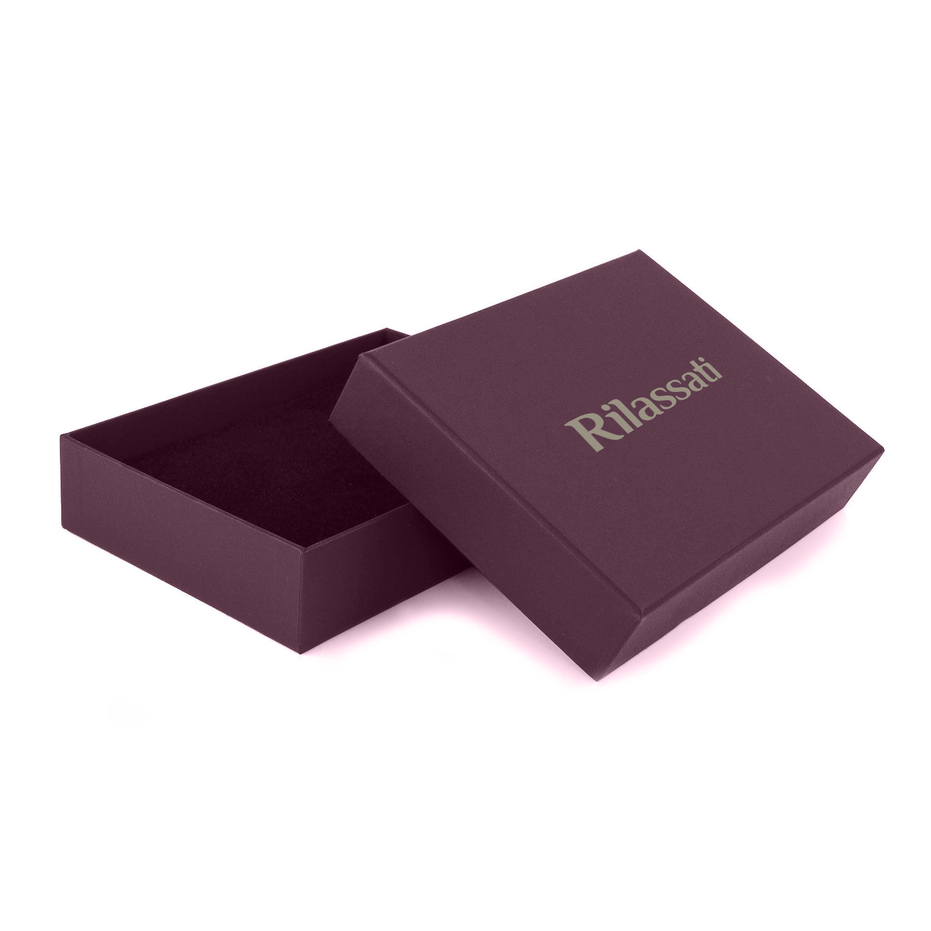
RILASSATI
Rilassati is a concept which unites Mediterranean taste with local Javanese materials and ingredients, a place where people can relax, enjoy the ambiance, have a taste of Mediterranean cuisine, appreciate the nature, purchase souvenirs as a reminder of good times, share experiences and learn something through our workshops.
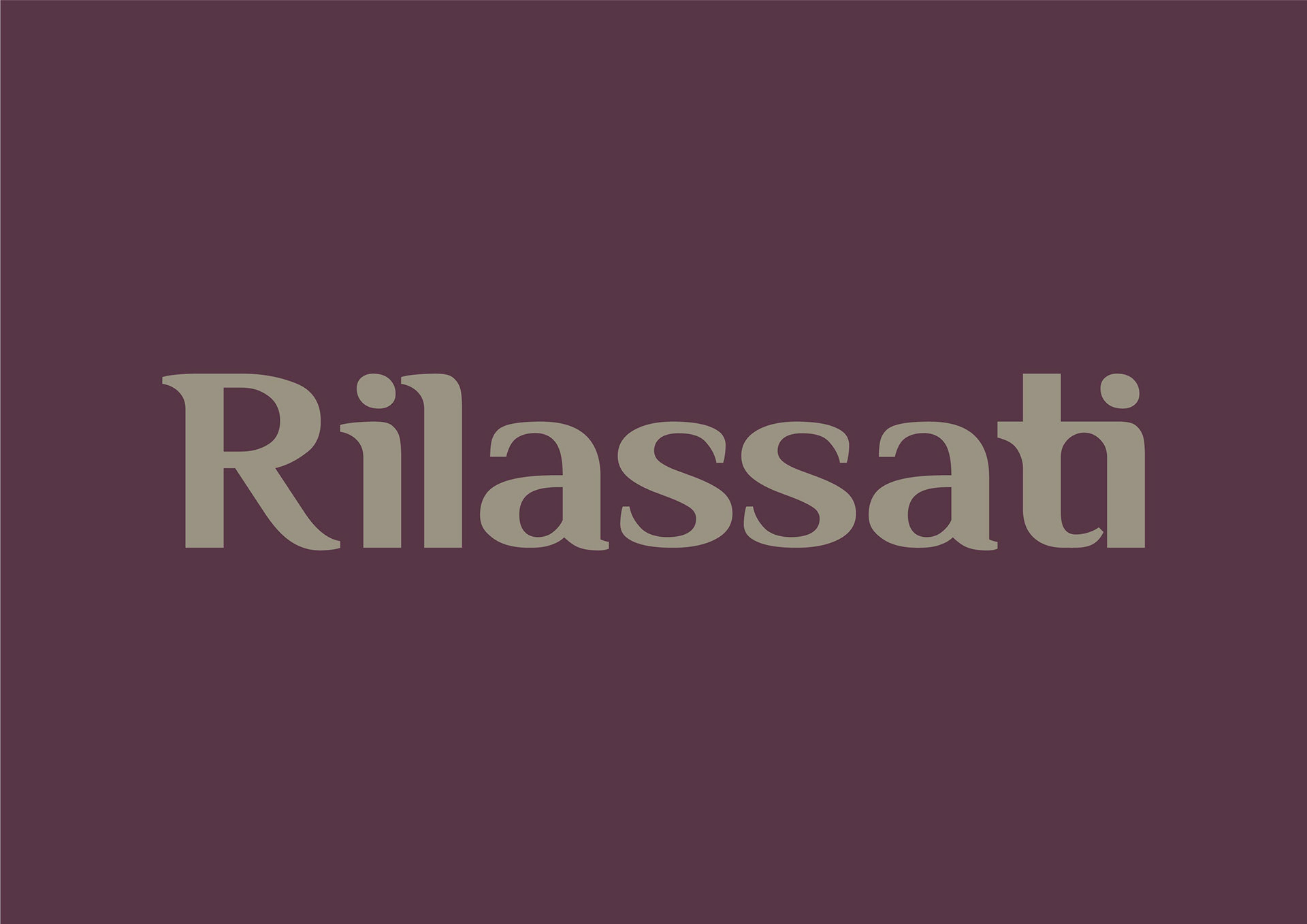
It is taken from an Italian word “Rilassati”, which means “calm yourself” / “take it easy”. The Rilassati Brand Logo is the primary logo for all communications and it should be used the most often. Furthermore, the logo can be used in different set of colors.

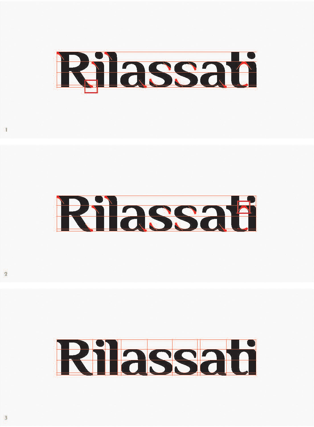
LOGO DEVELOPMENT
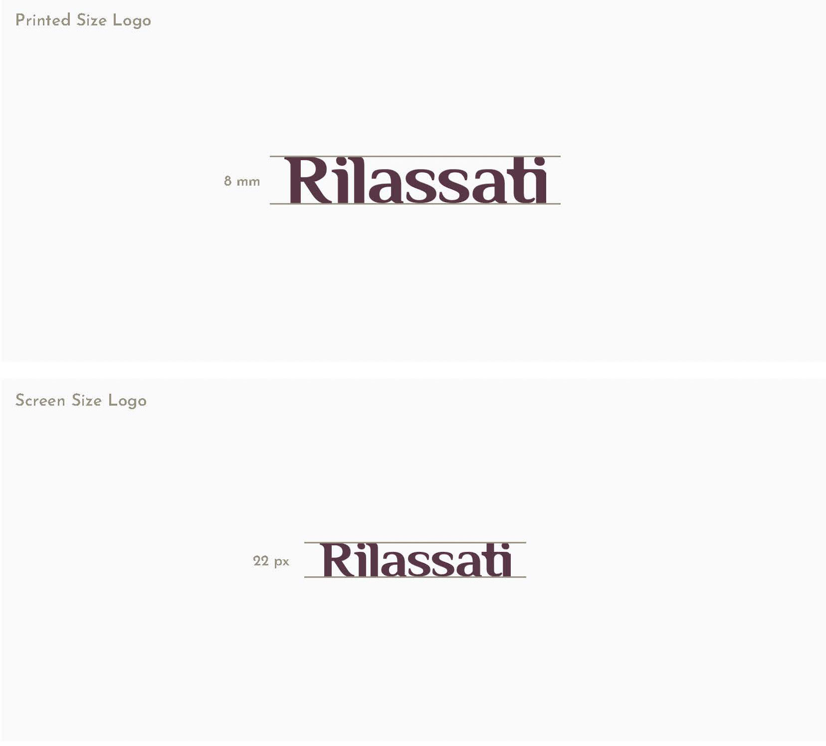
MINIMUM SIZE

CLEAR SPACE
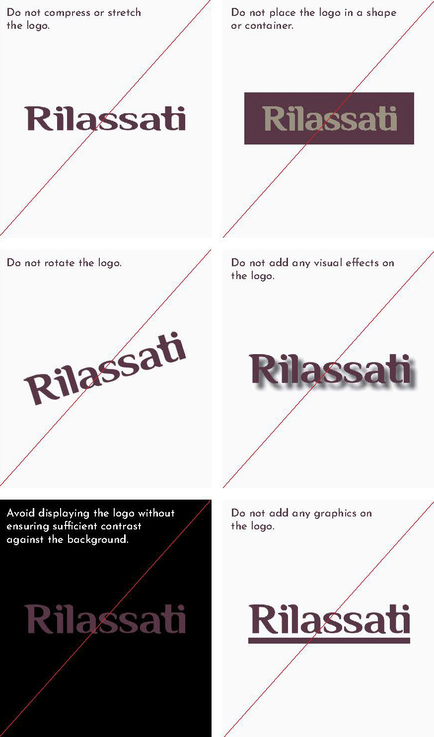
PROHIBITED USAGE
VISUAL STANDARDS BOOK GUIDE
VISUAL STANDARDS BOOK CONTENT
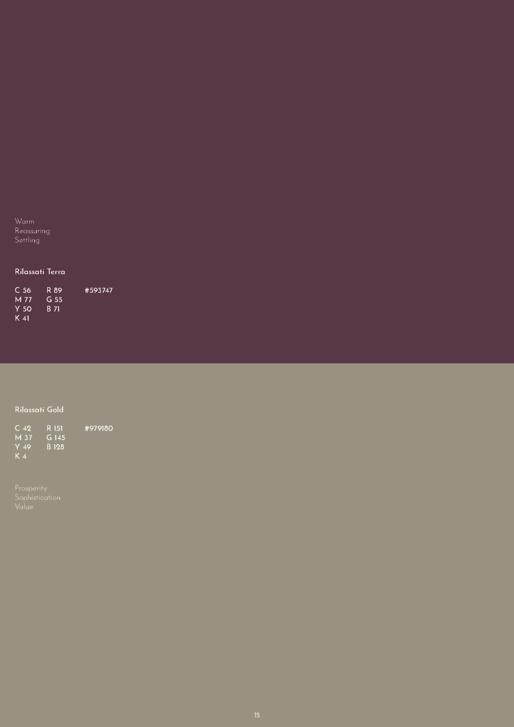
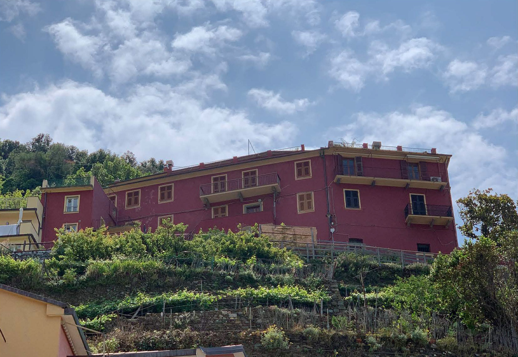
The color palette was picked from this beautiful house in Manarola. It’s a house which stands out with its colors from all the other houses and buildings in the surrounding of the second-smallest of the famous Cinque Terre towns.
Rilassati operates as a:
RESTAURANT, Mediterranean inspired food with local ingredients.
CAFE, bakery & coffee.
SOUVENIR SHOP, home decorations, clothes and souvenirs from local artisans.
OPEN-SPACE, pilates, yoga, but also as a workshop or a banquet.
CAFE, bakery & coffee.
SOUVENIR SHOP, home decorations, clothes and souvenirs from local artisans.
OPEN-SPACE, pilates, yoga, but also as a workshop or a banquet.
PACKAGING MOCKUP
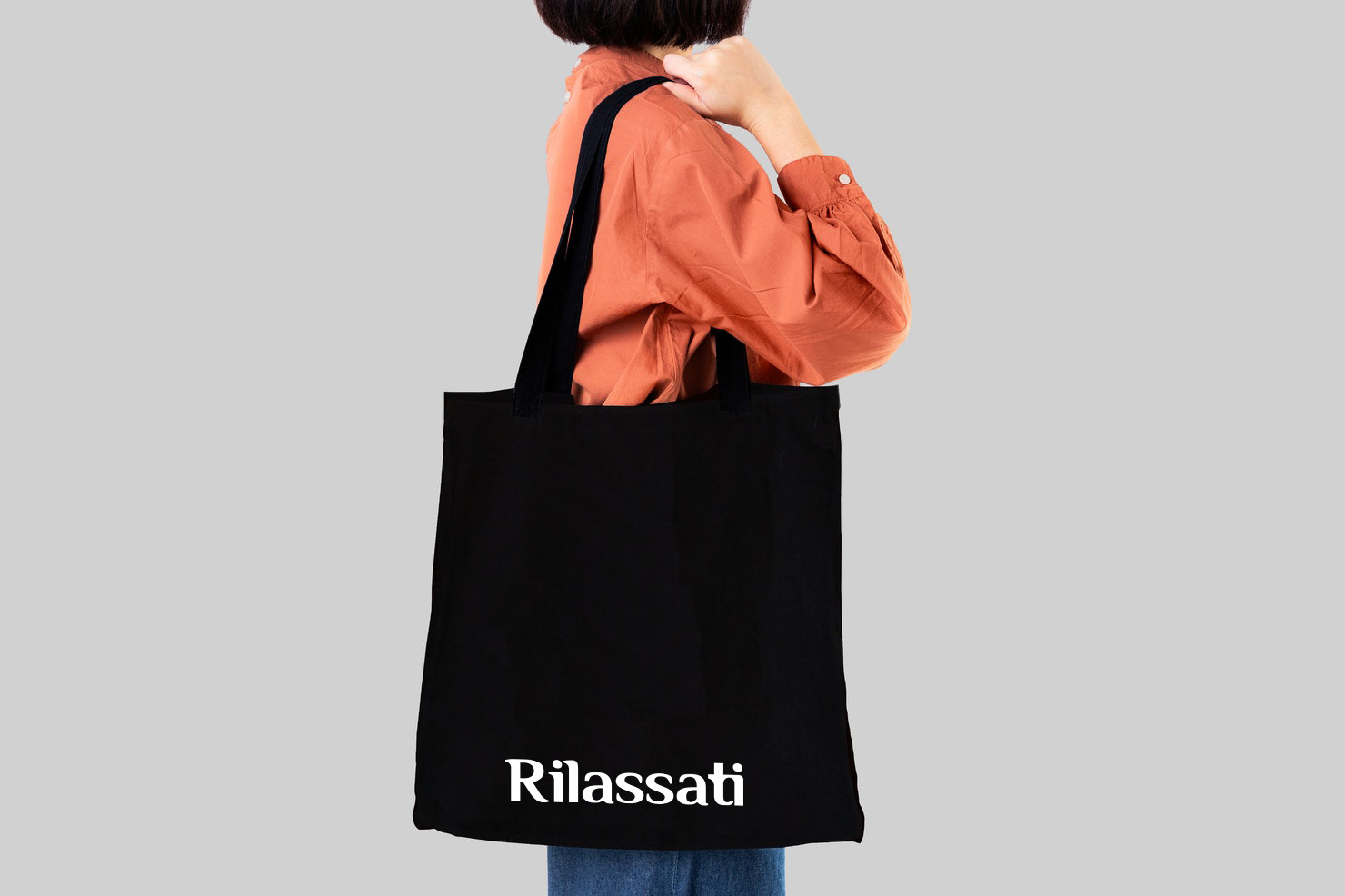
TOTE BAG
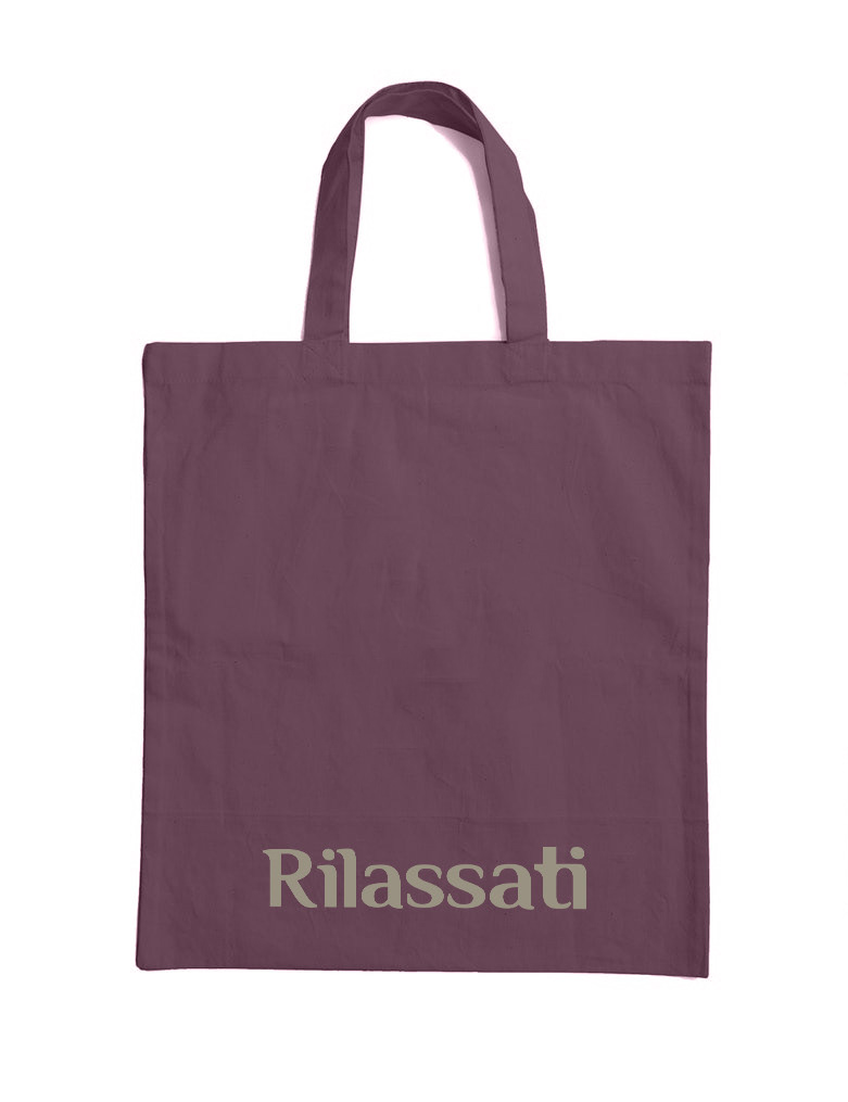
TOTE BAG
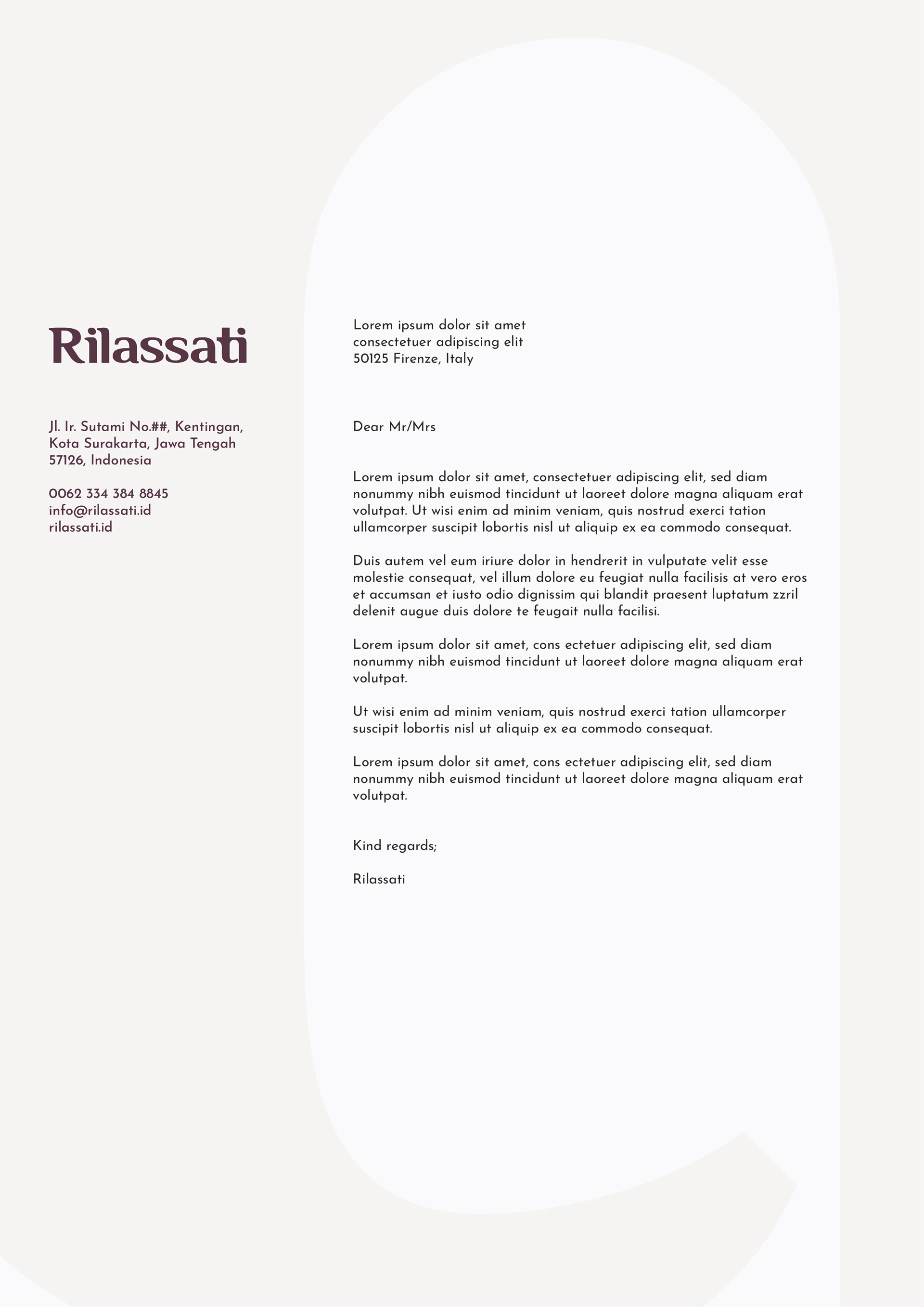
STATIONERY
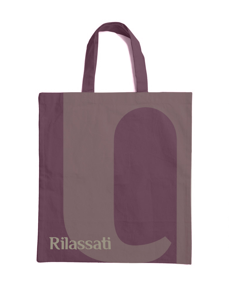
TOTE BAG
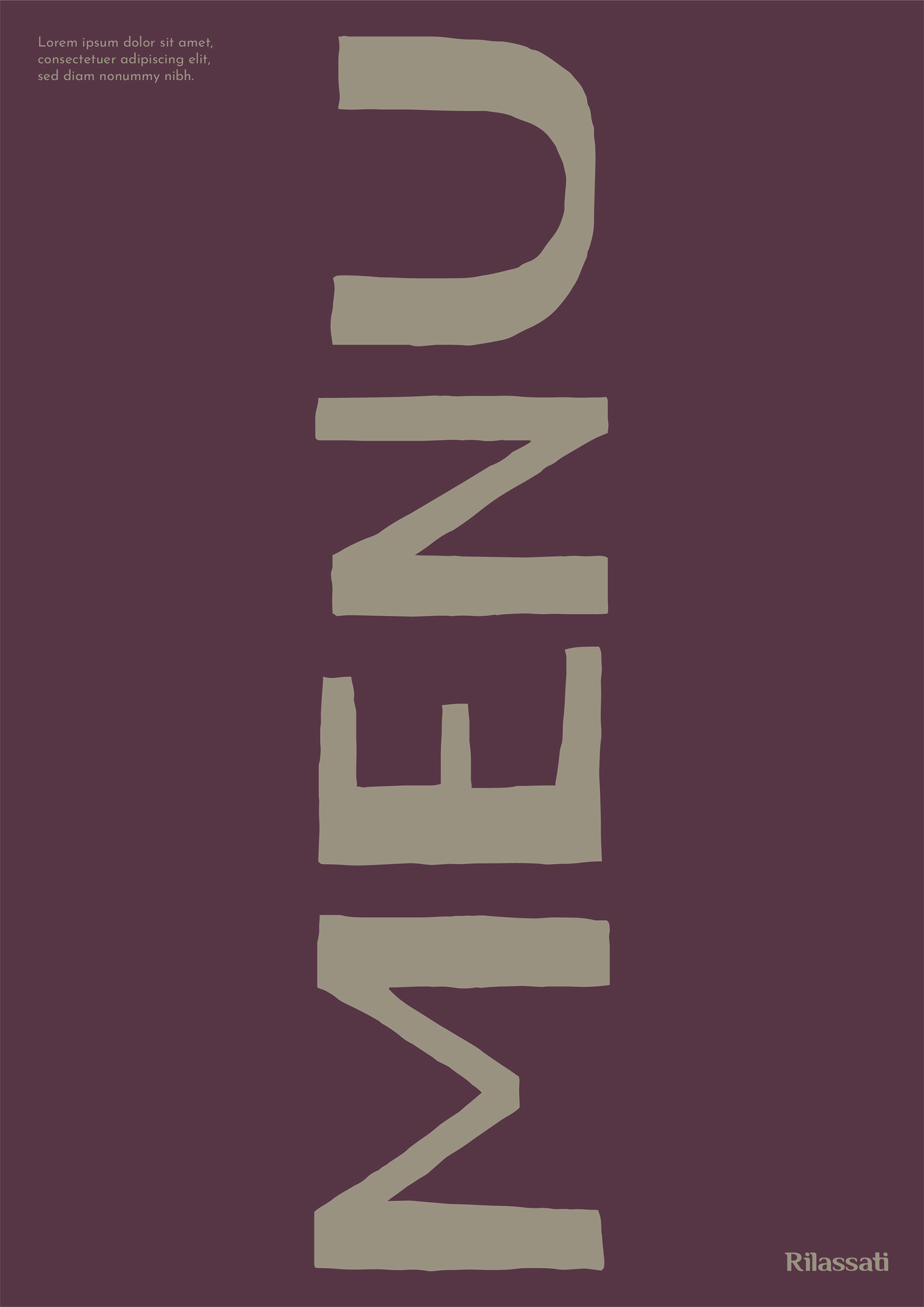
MENU COVER
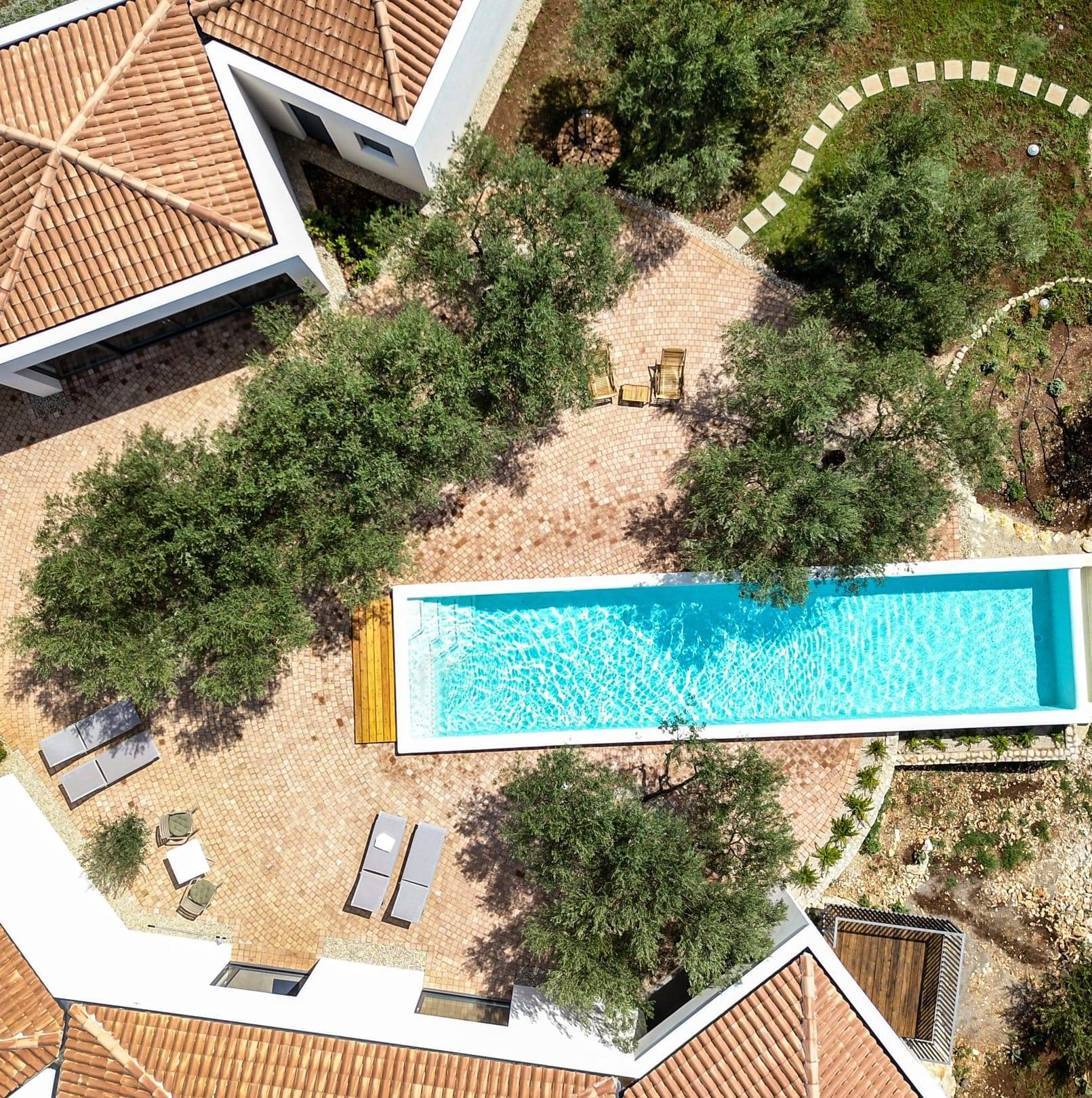
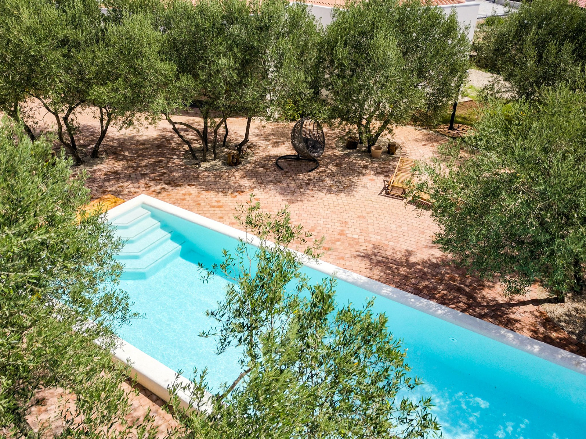
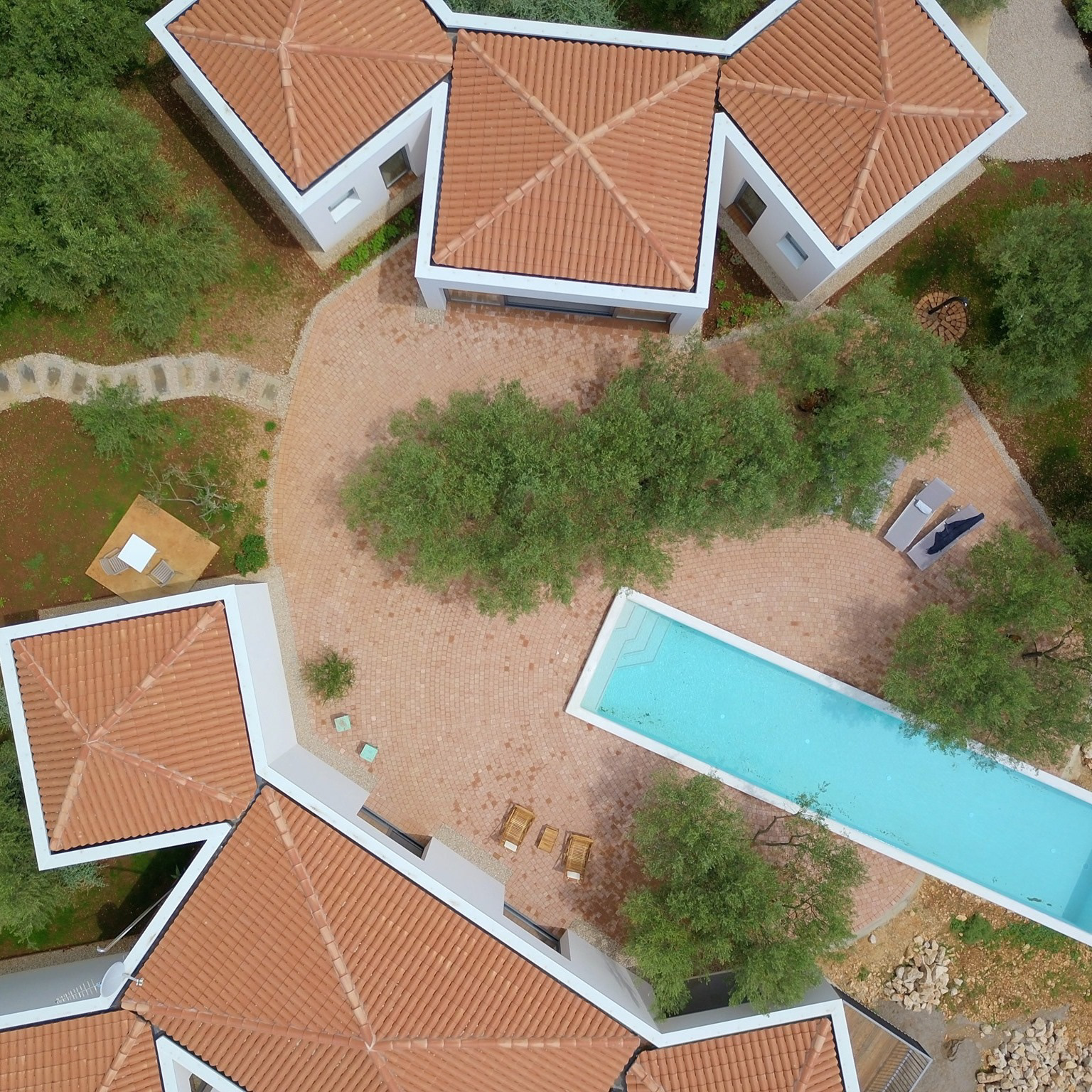
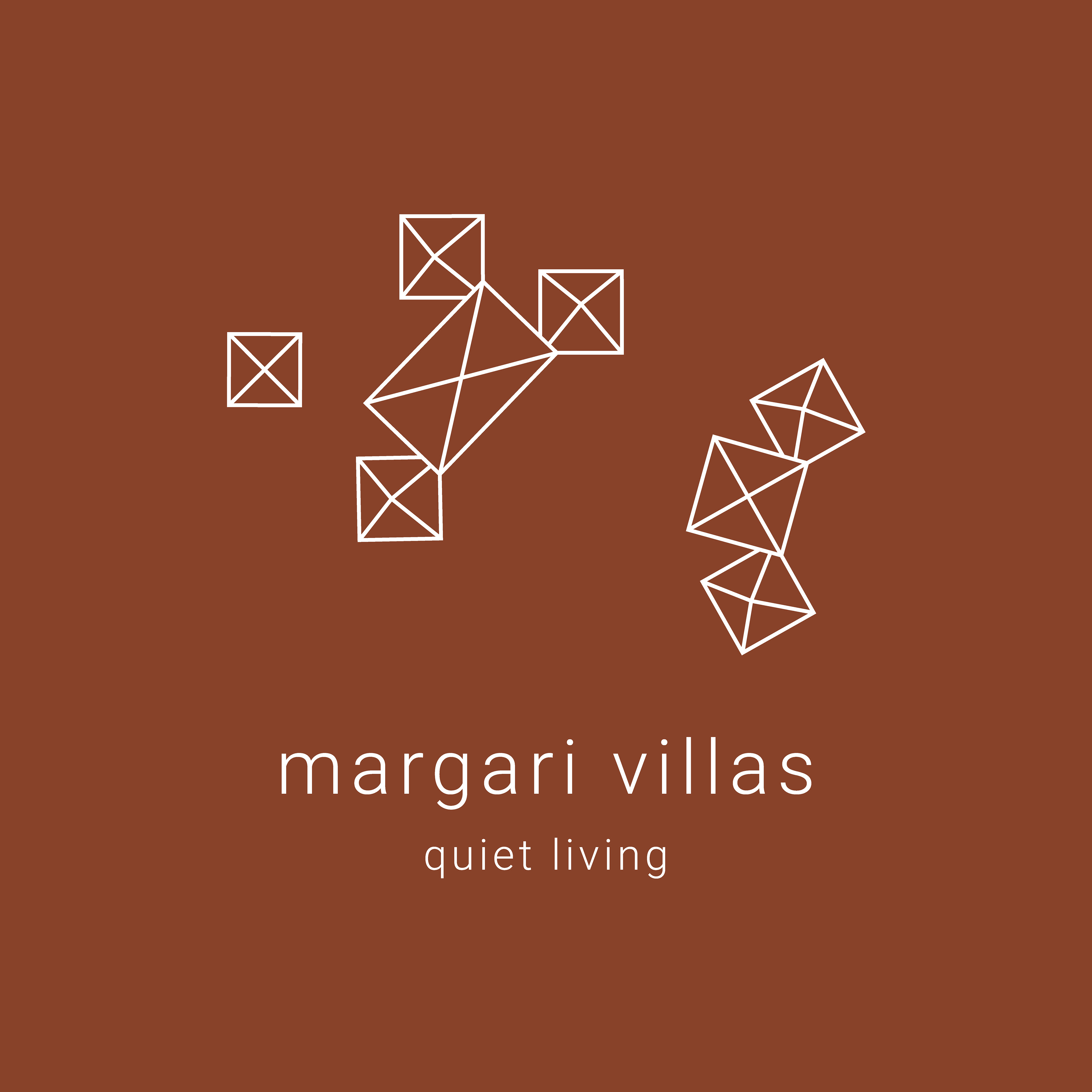
MARGARI VILLAS
Margari Villas is a residential house for vacation situated in a quiet village of Linardići on the Island of Krk. The house is a unique architectural space, integrated in the natural surrounding of olive groves.
PROPERTY CONFIGURATION/1
PROPERTY CONFIGURATION/2
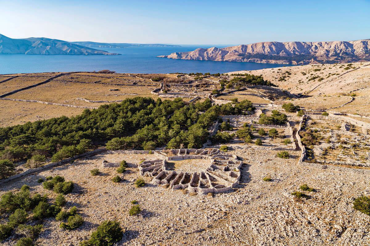
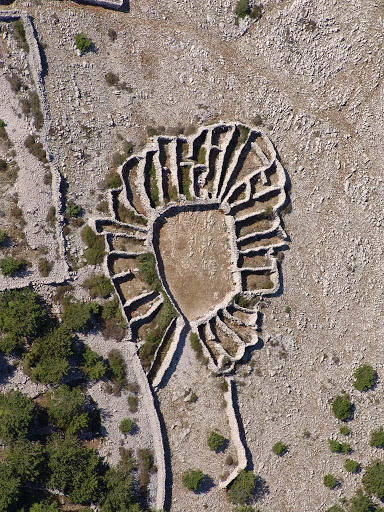
The name of the vacation residence derives from a word 'mrgari' which represents a flower shaped dry stone multicellular sheepfold. Very popular aerial views and photos of them were the inspiration in creating a visual identity of this vacation home.
Visual identity of the property embodies a peaceful and minimal lifestyle that this place guarantees to all of its guests. The color of terracotta which is present in its surrounding gives this place a feeling of grounding and relaxing, which is embodied in the property's mantra - 'quiet living'.
FINAL LOGO/1
FINAL LOGO/2
TEXTUAL LOGO/1

TEXTUAL LOGO/2
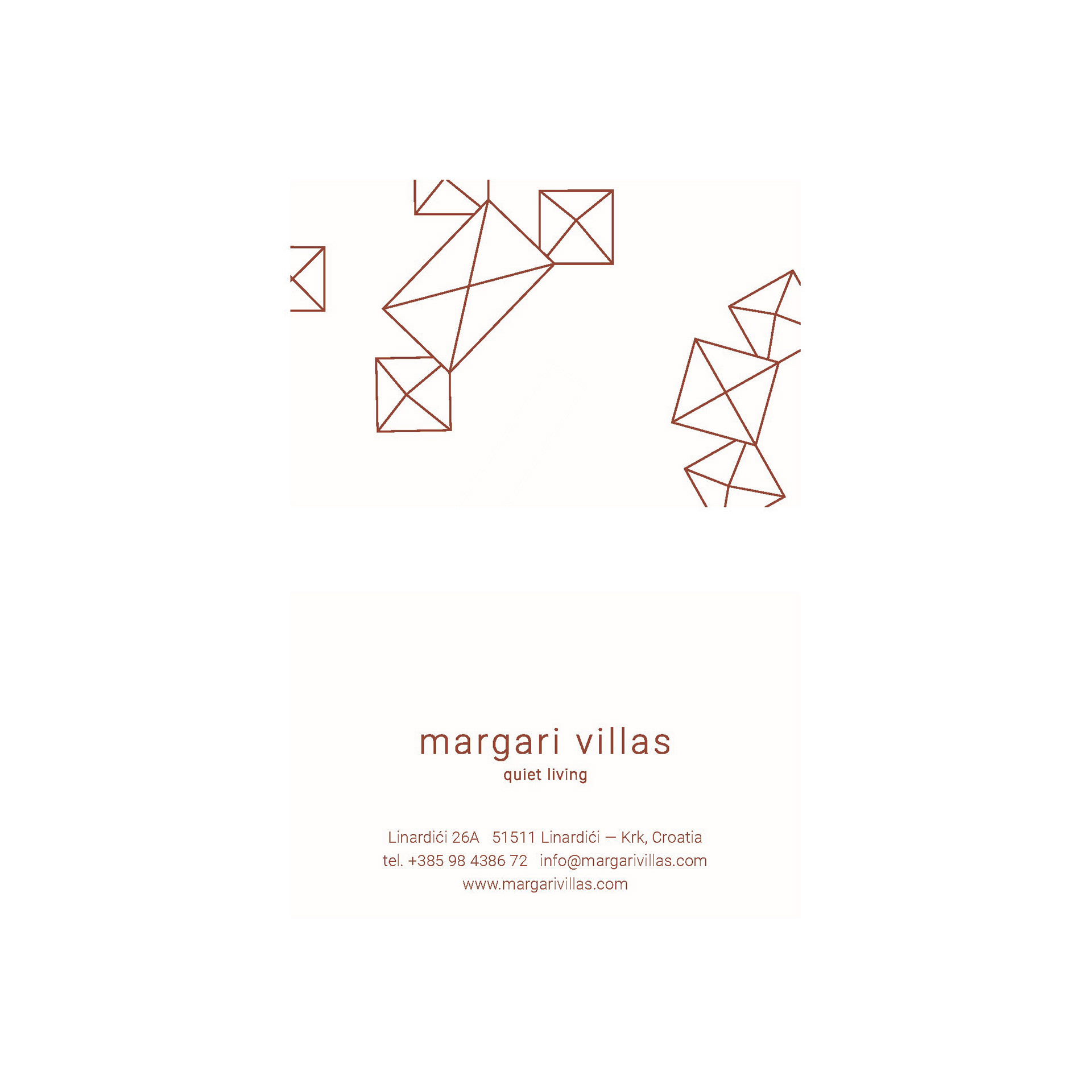
BUSINESS CARD PROPOSAL
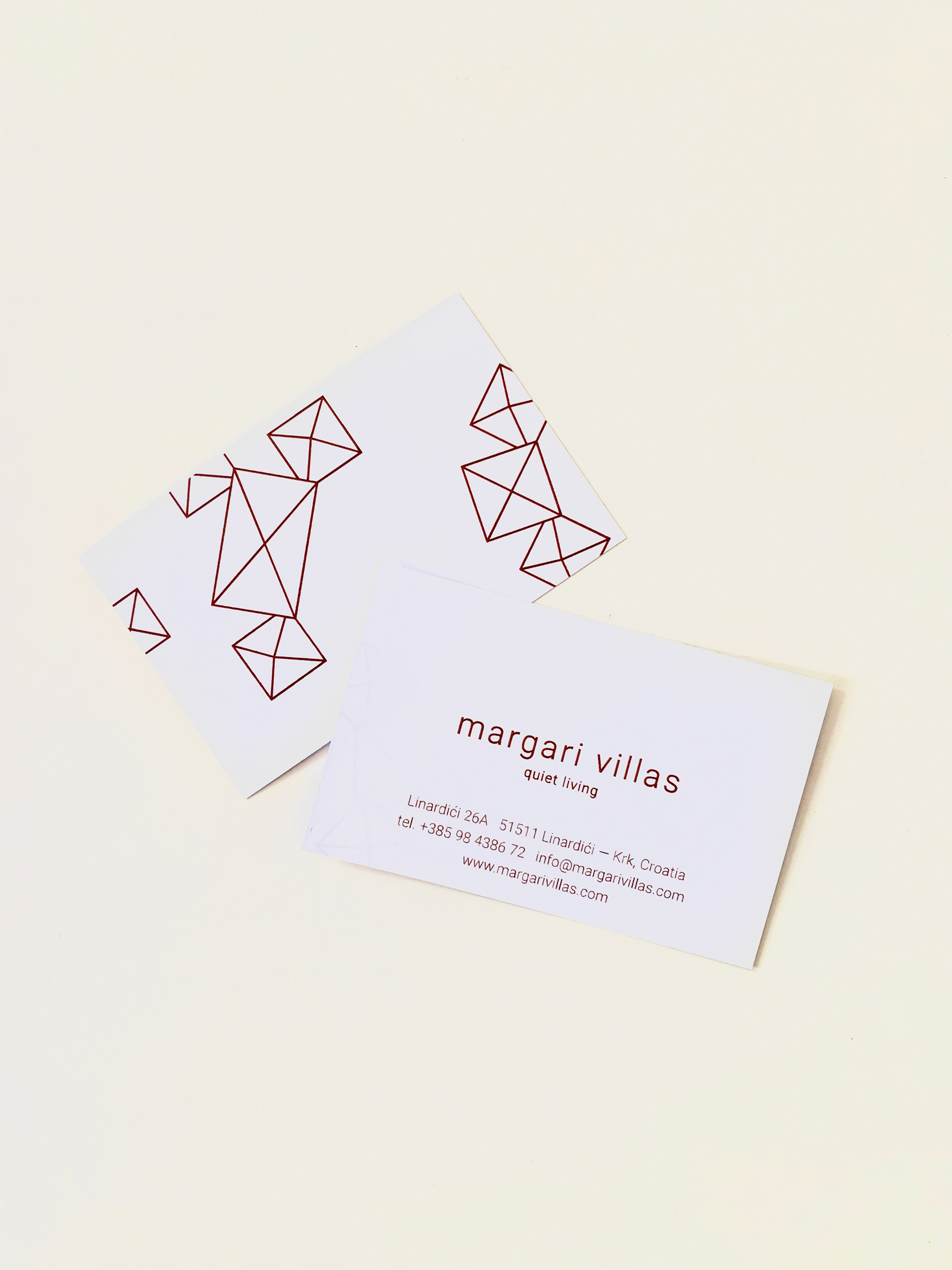
BUSINESS CARD FINAL
VITA VITALIS
Vita Vitalis is a business to business (B2B) company whose core business is to provide Spa services, projects and high-quality products mainly for hotels in the region. Some of the main company traits are: exclusivity, individuality, quality, elegance and sophistication. The client asked me to embody all these into the brand's visual identity, as well as to propose a substitute name.
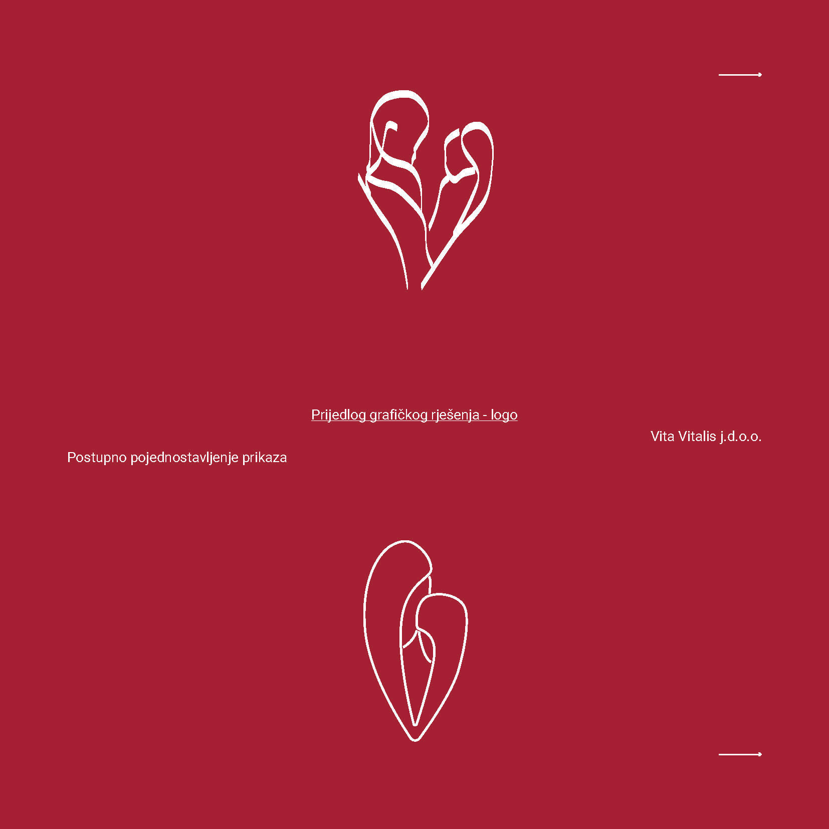
LOGO DEVELOPMENT/1
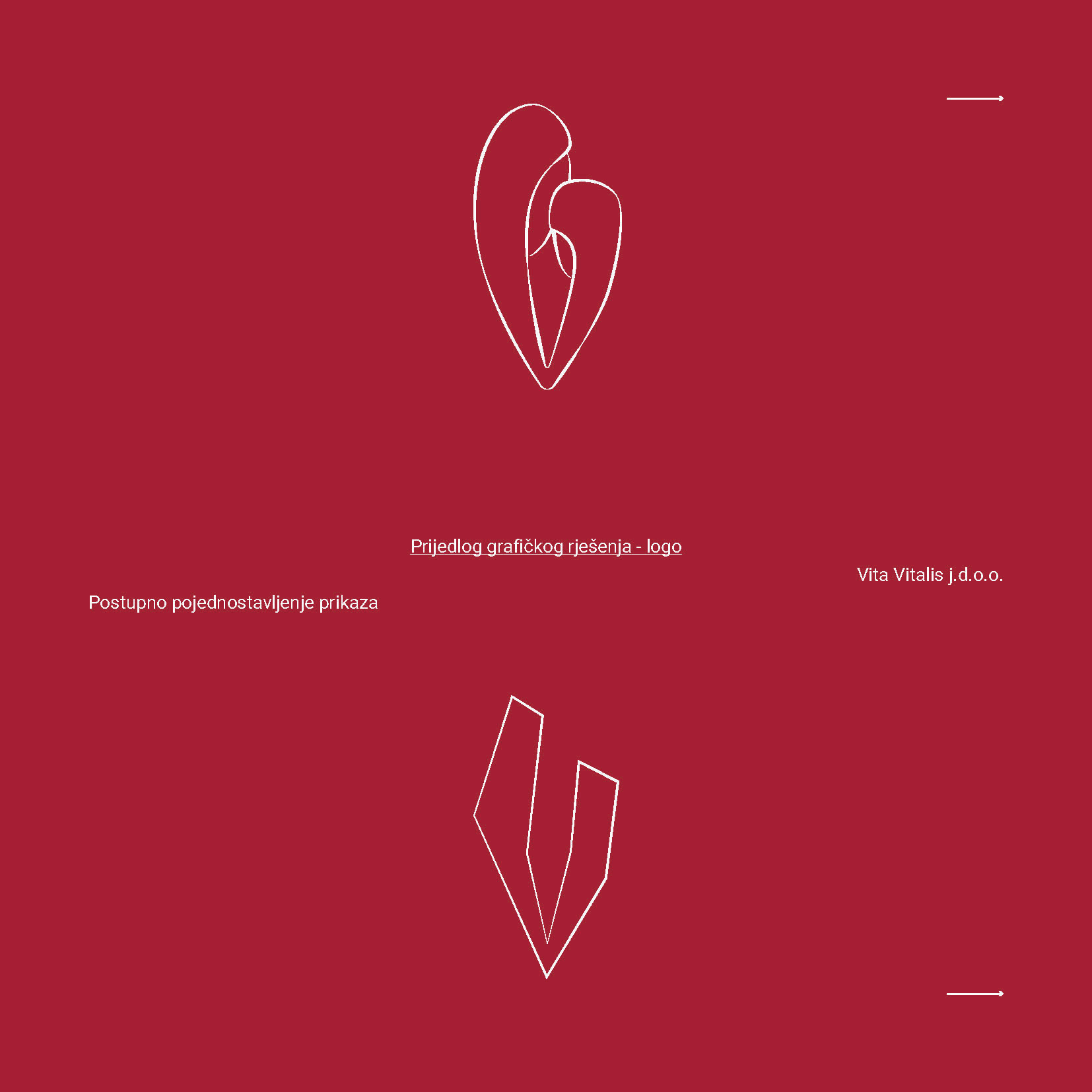
LOGO DEVELOPMENT/2
LOGO DEVELOPMENT/3
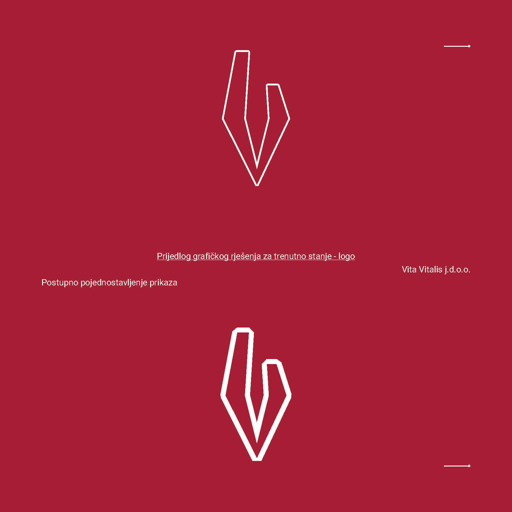
LOGO PROPOSAL
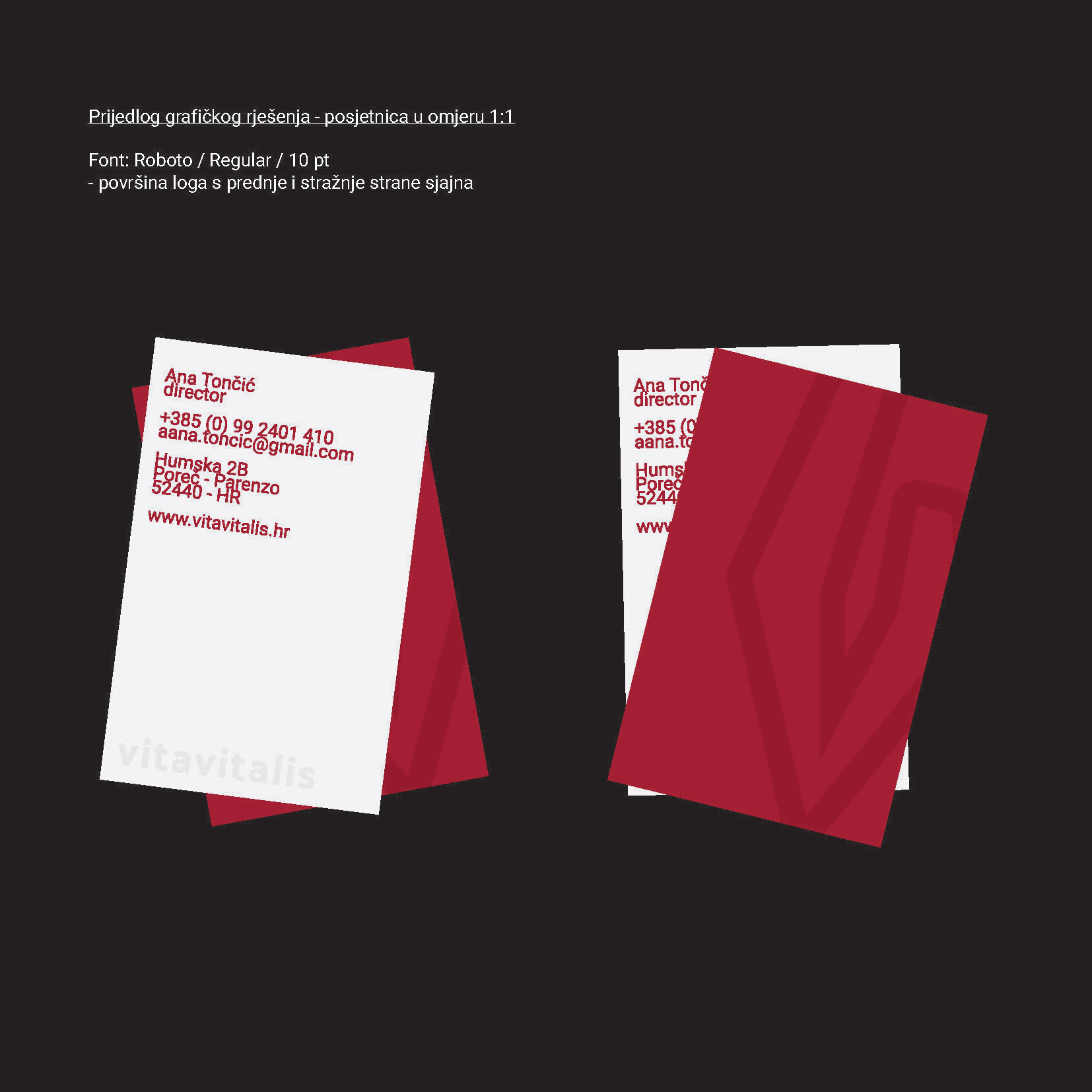
BUSINESS CARDS PROPOSAL
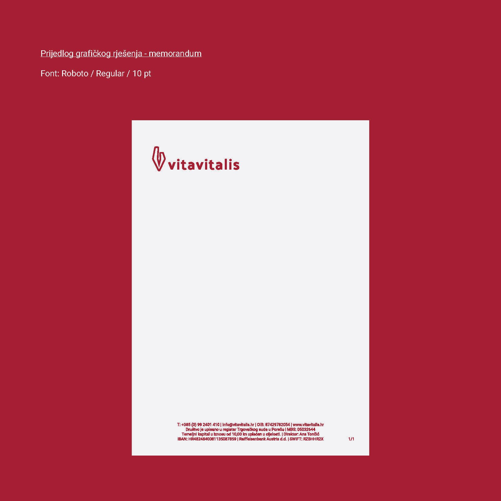
MEMORANDUM PROPOSAL
Some of the substitue name proposals were: Balneovita, Mineralvita, Vitawells, Euvita...
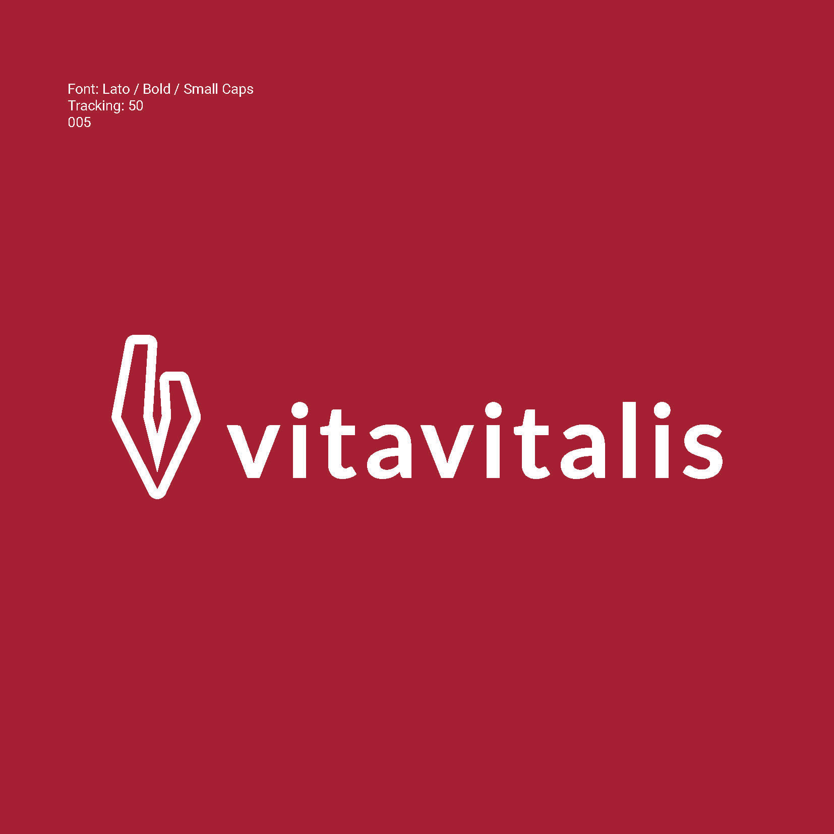
But at the end, client decided to stick to the initial company name and choose a second version of visual identity, a very minimalistic one, formed from a leaf, as a symbol of life accompanied with the letter 'V'.
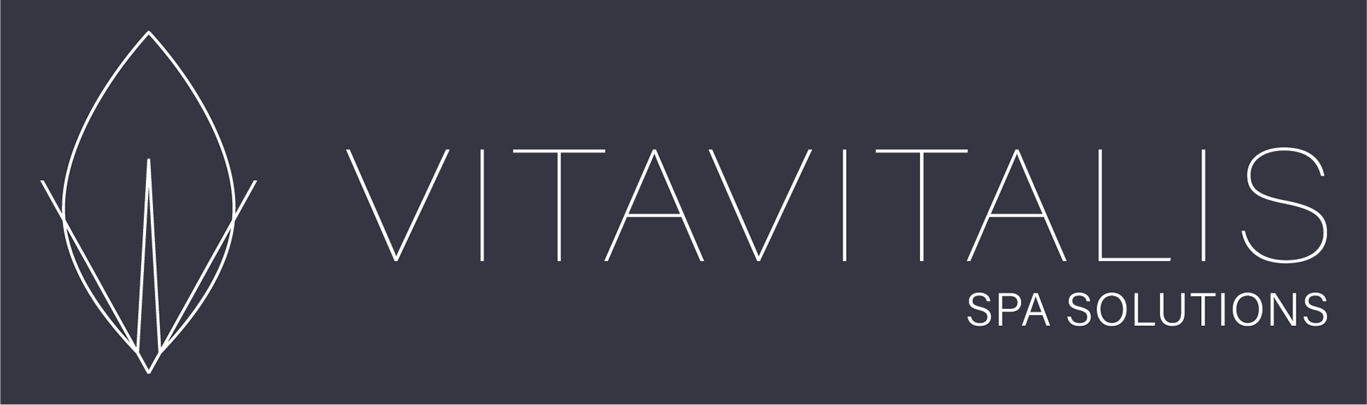
FINAL LOGO/1
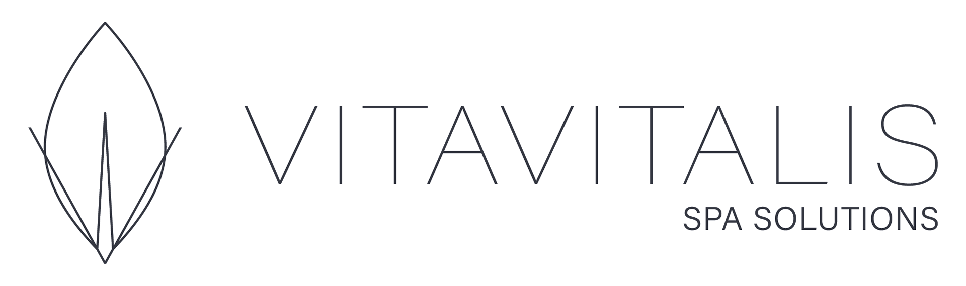
FINAL LOGO/2
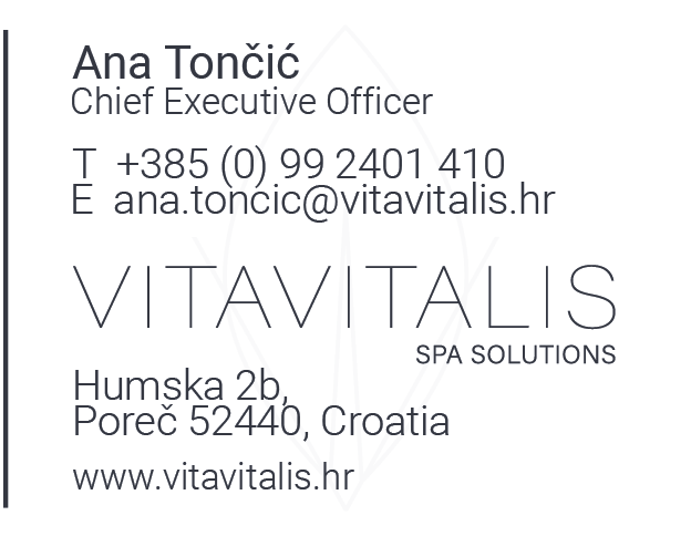
MAIL SIGNATURE
“Wellness refers to diverse and interconnected dimensions of physical, mental, and social well-being that extend beyond the traditional definition of health. It includes choices and activities aimed at achieving physical vitality, mental alacrity, social satisfaction, a sense of accomplishment, and personal fulfillment.”
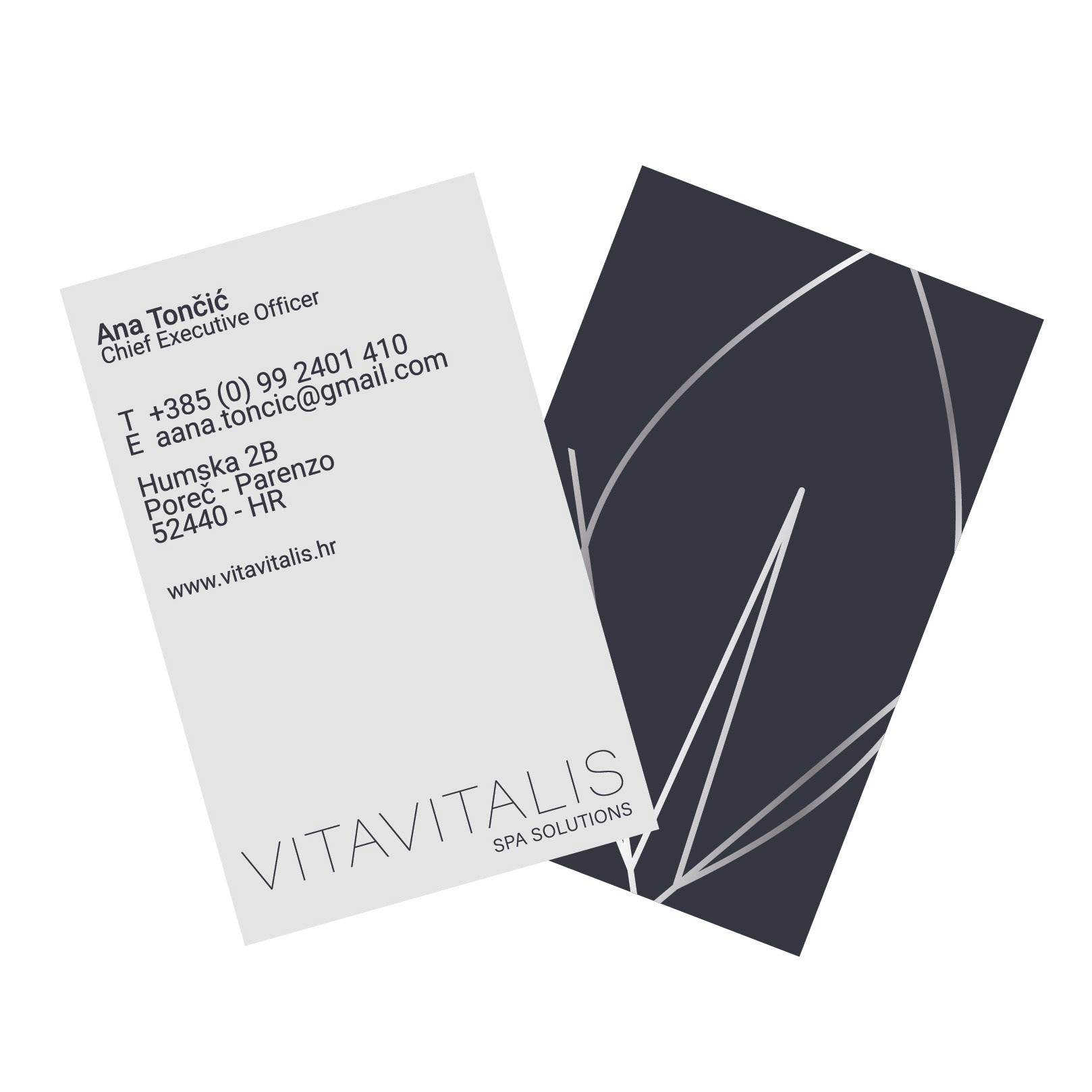
FINAL BUSINESS CARD
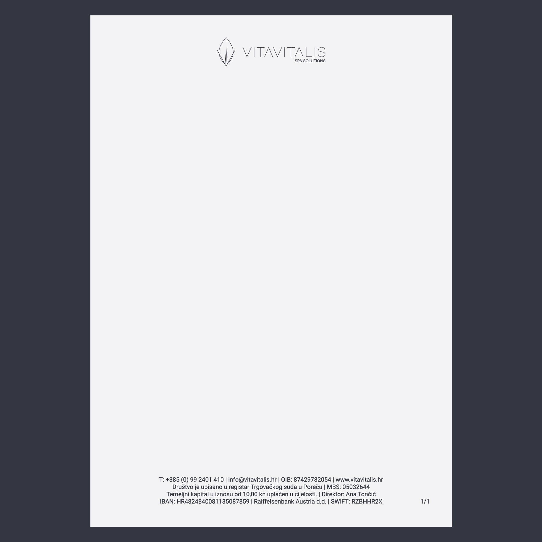
FINAL MEMORANDUM

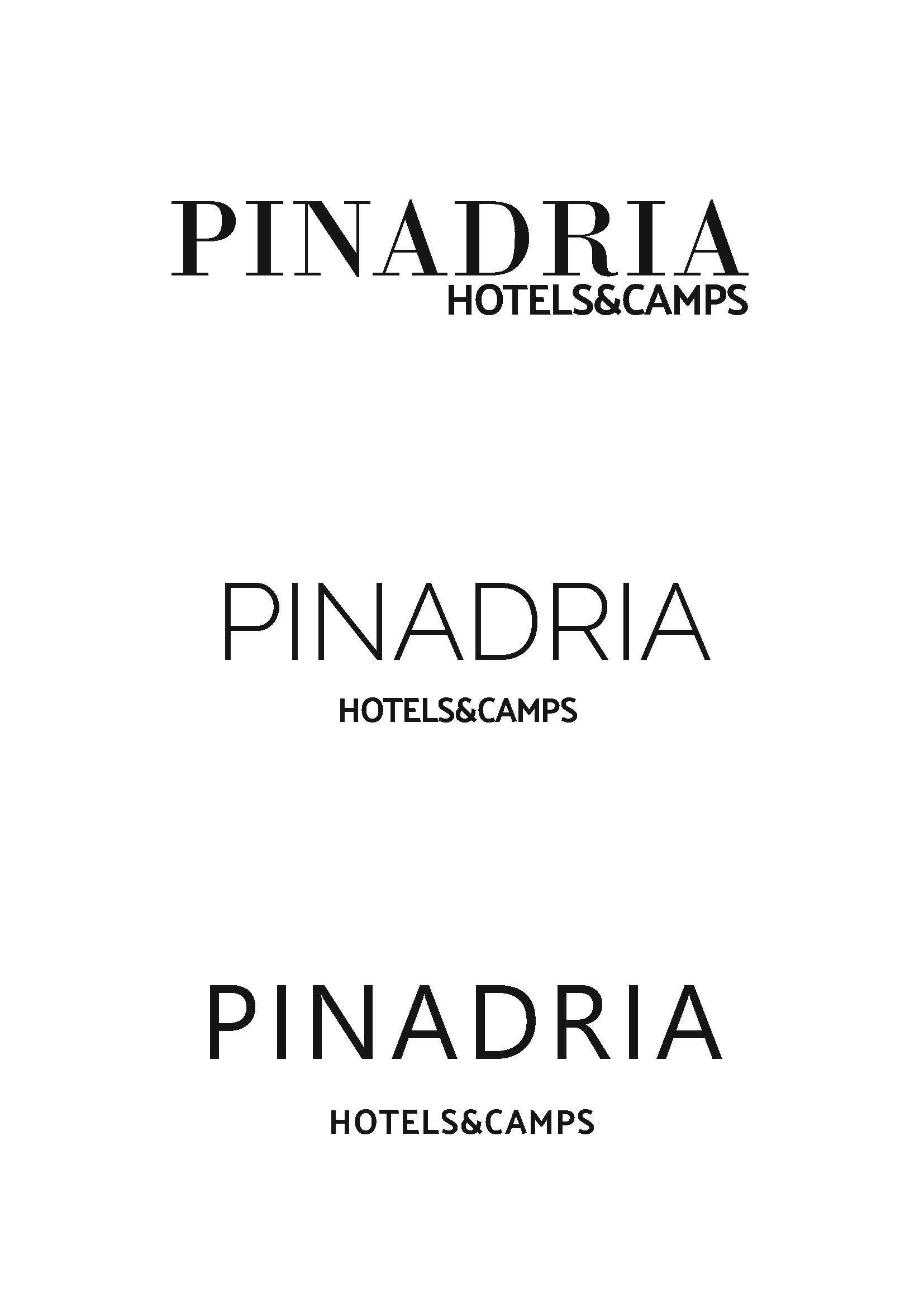
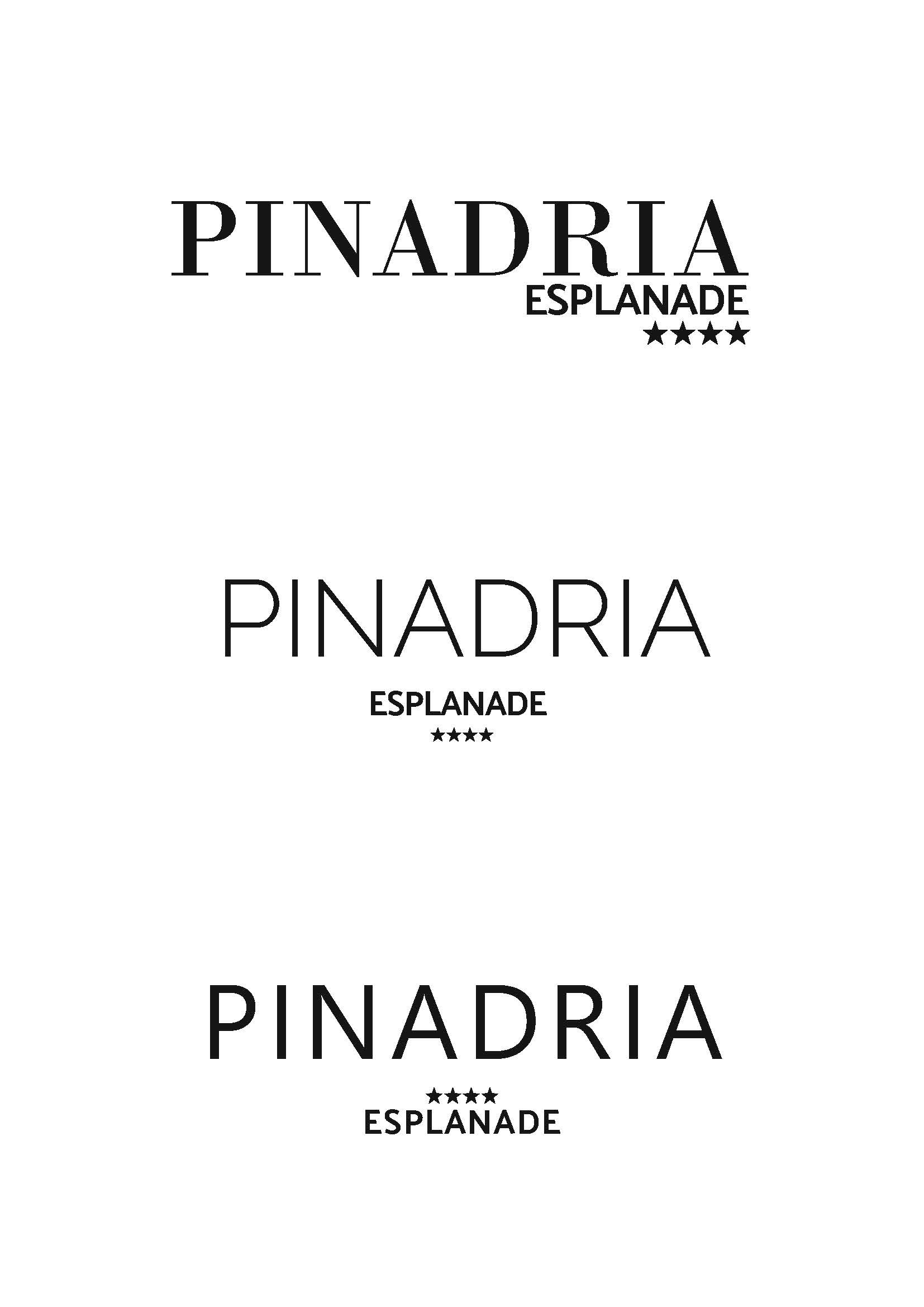
LOGO DEVELOPMENT
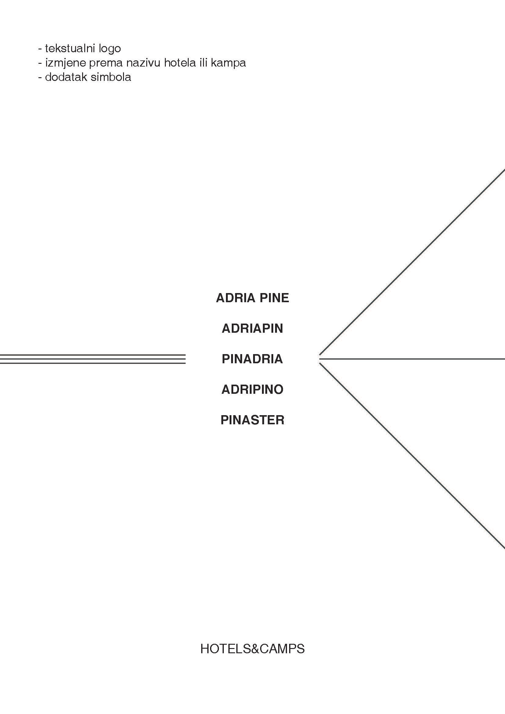
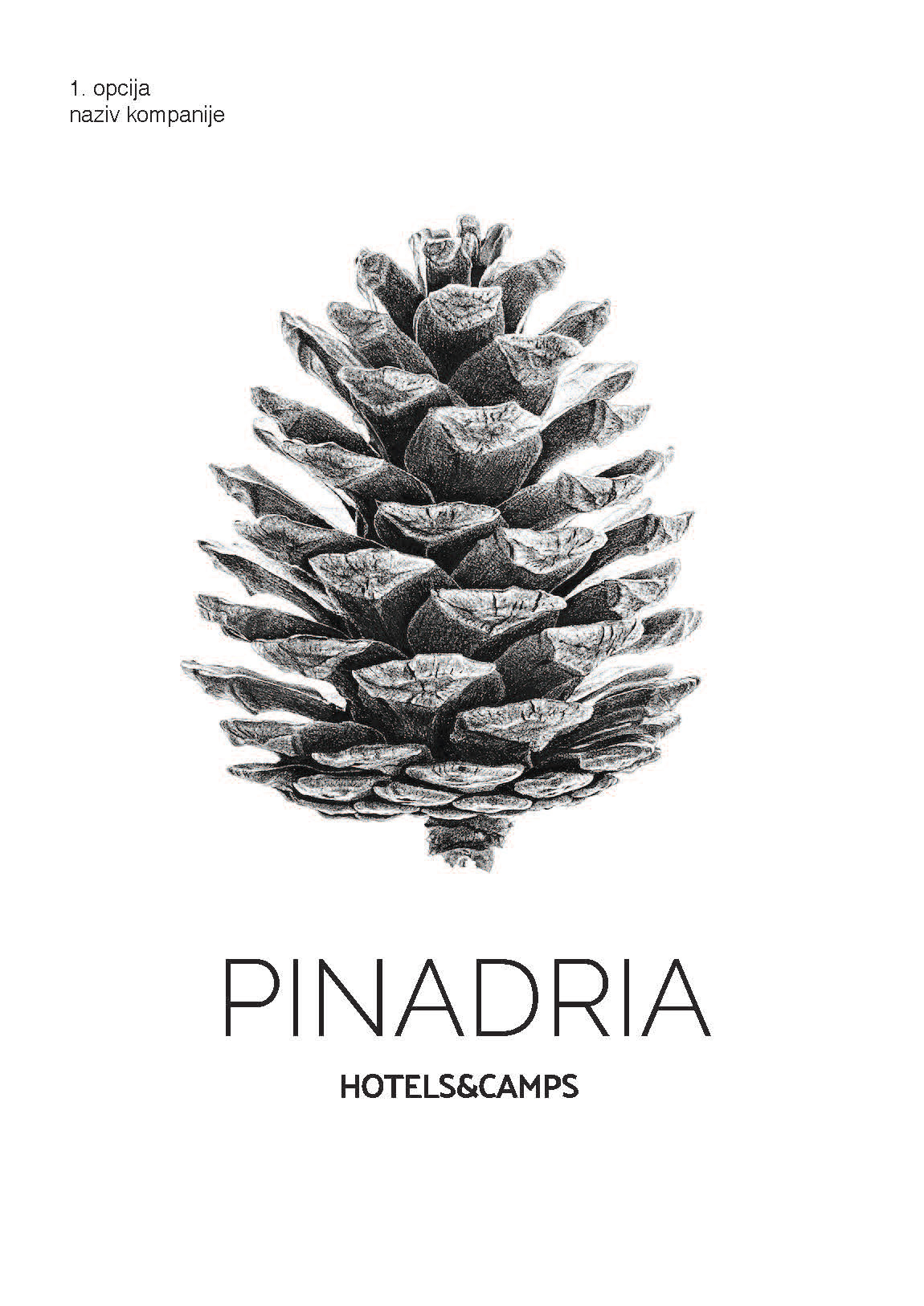
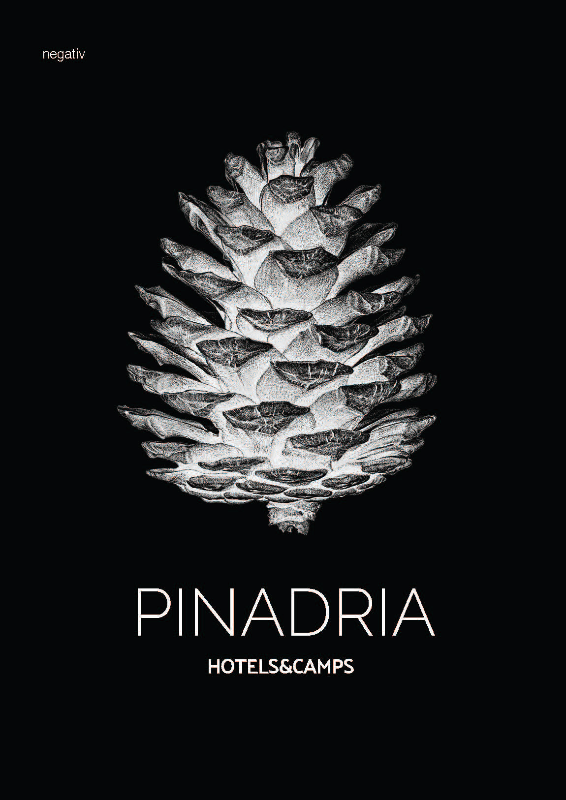
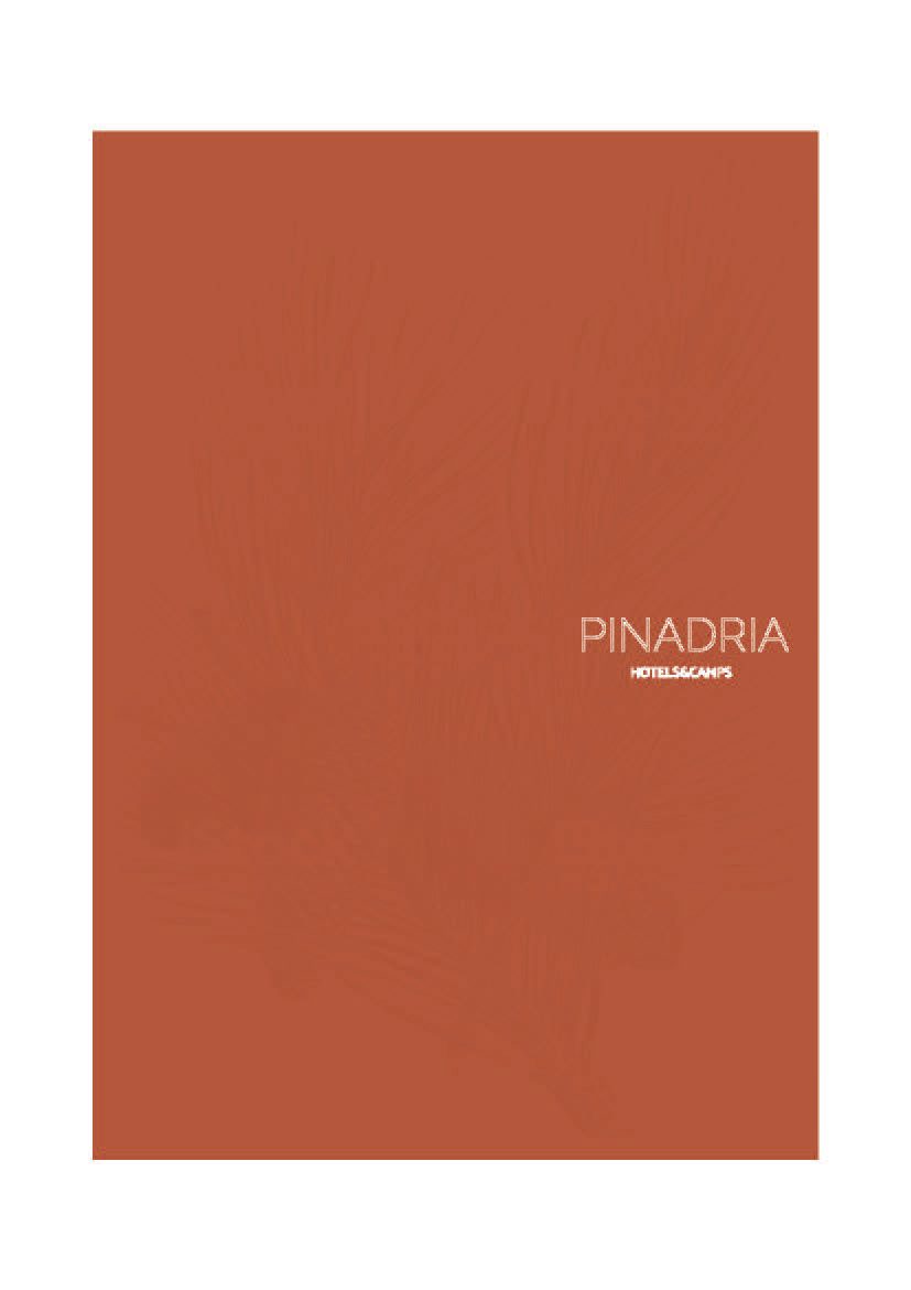
PINADRIA Hotels & Camps
Jadran is the largest hotel company on the Crikvenica-Vinodol Riviera. The company is headquartered in Crikvenica and is one of the biggest names in the tourism business on the Adriatic coast. Jadran Group also operates several hotel properties outside the group’s own portfolio. Jadran provides catering and tourism services at hotels and resorts of different categories with over 2,500 beds in 1,250 rooms and 1,700 lodgings in camping facilities.
With new management on board, the company is looking to refresh the visual identity of the company, and potentially change its name.
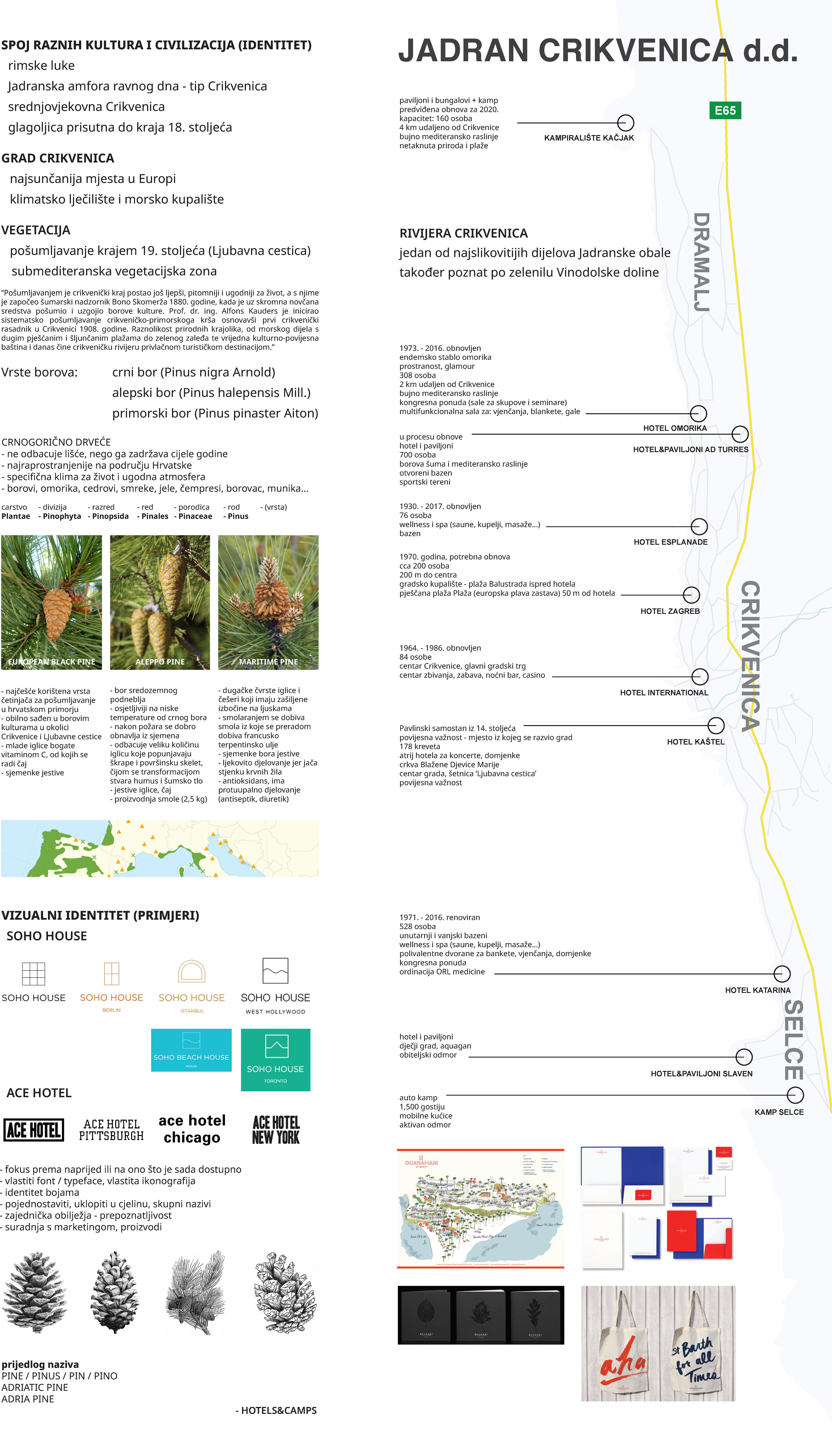
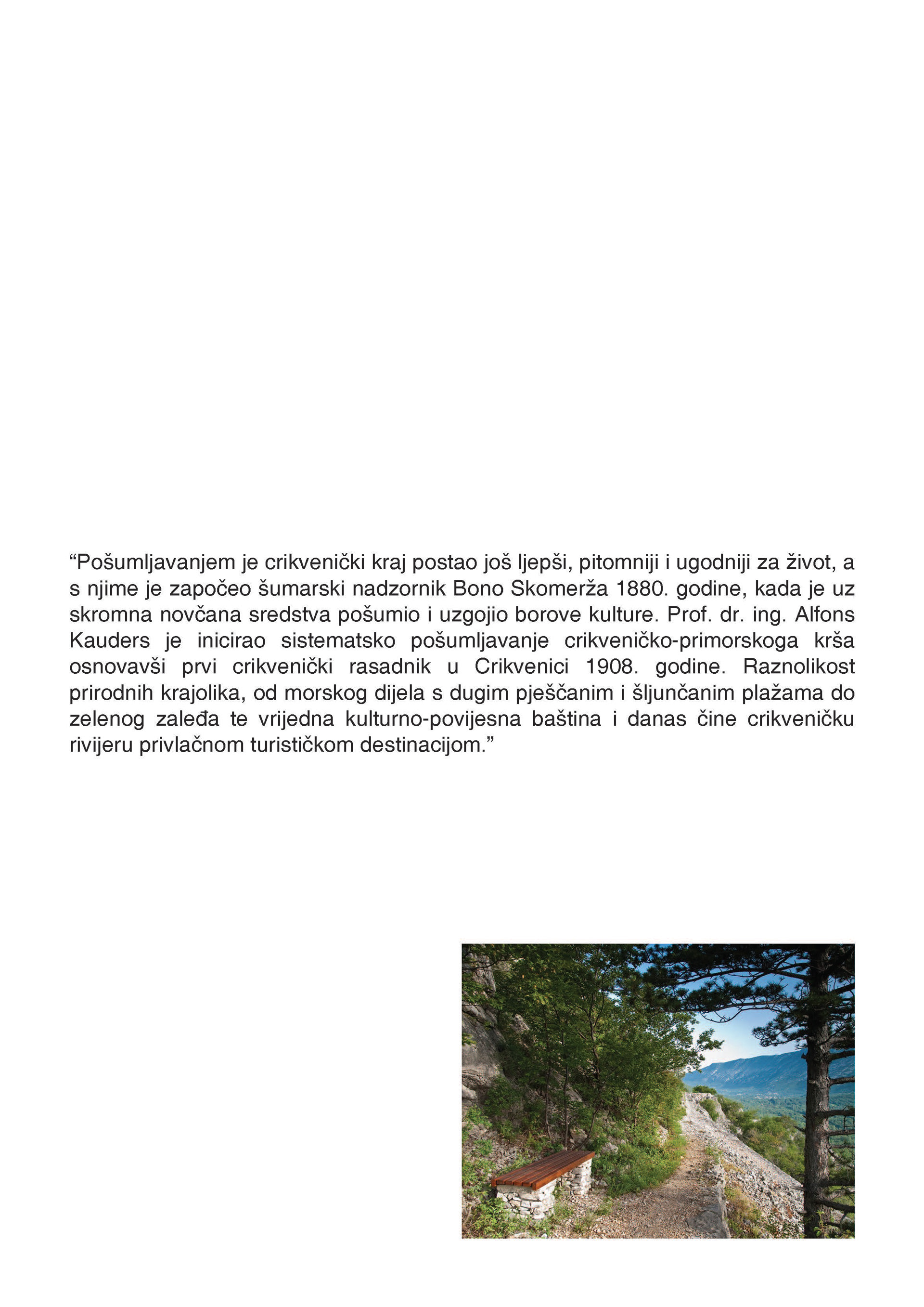
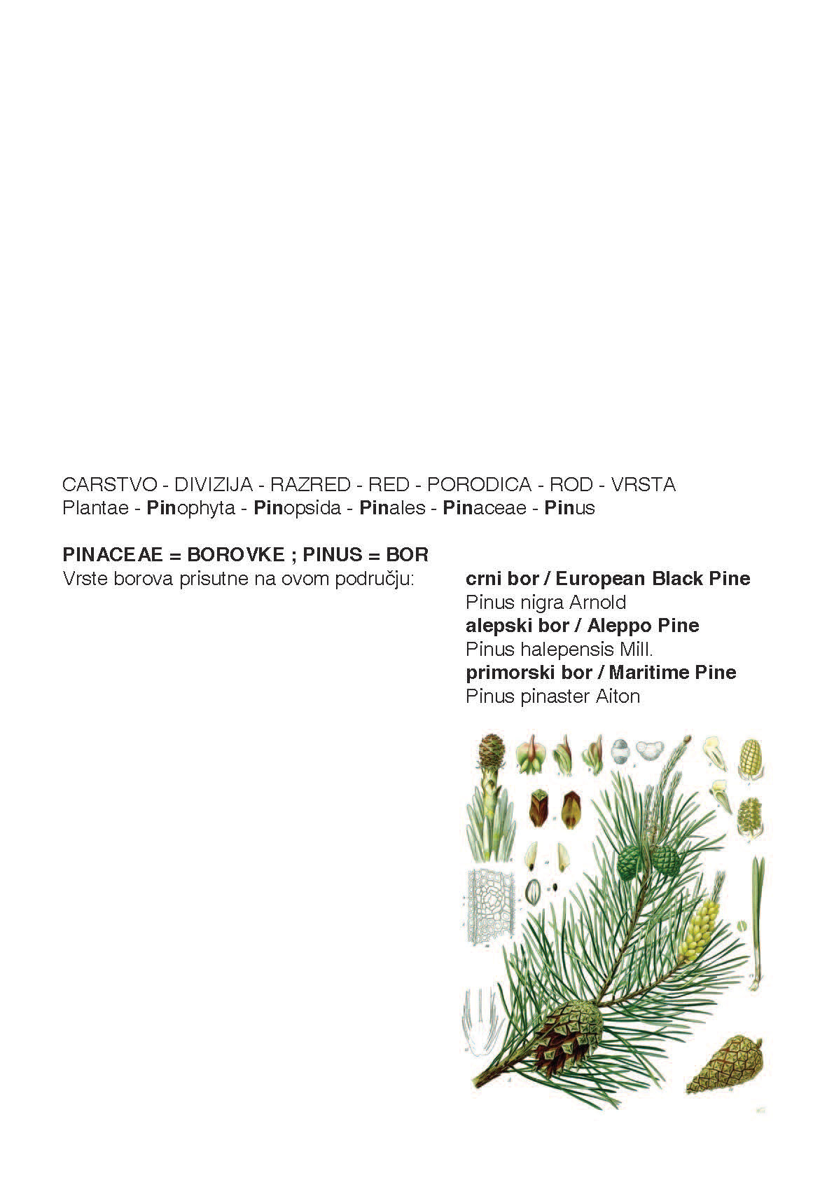
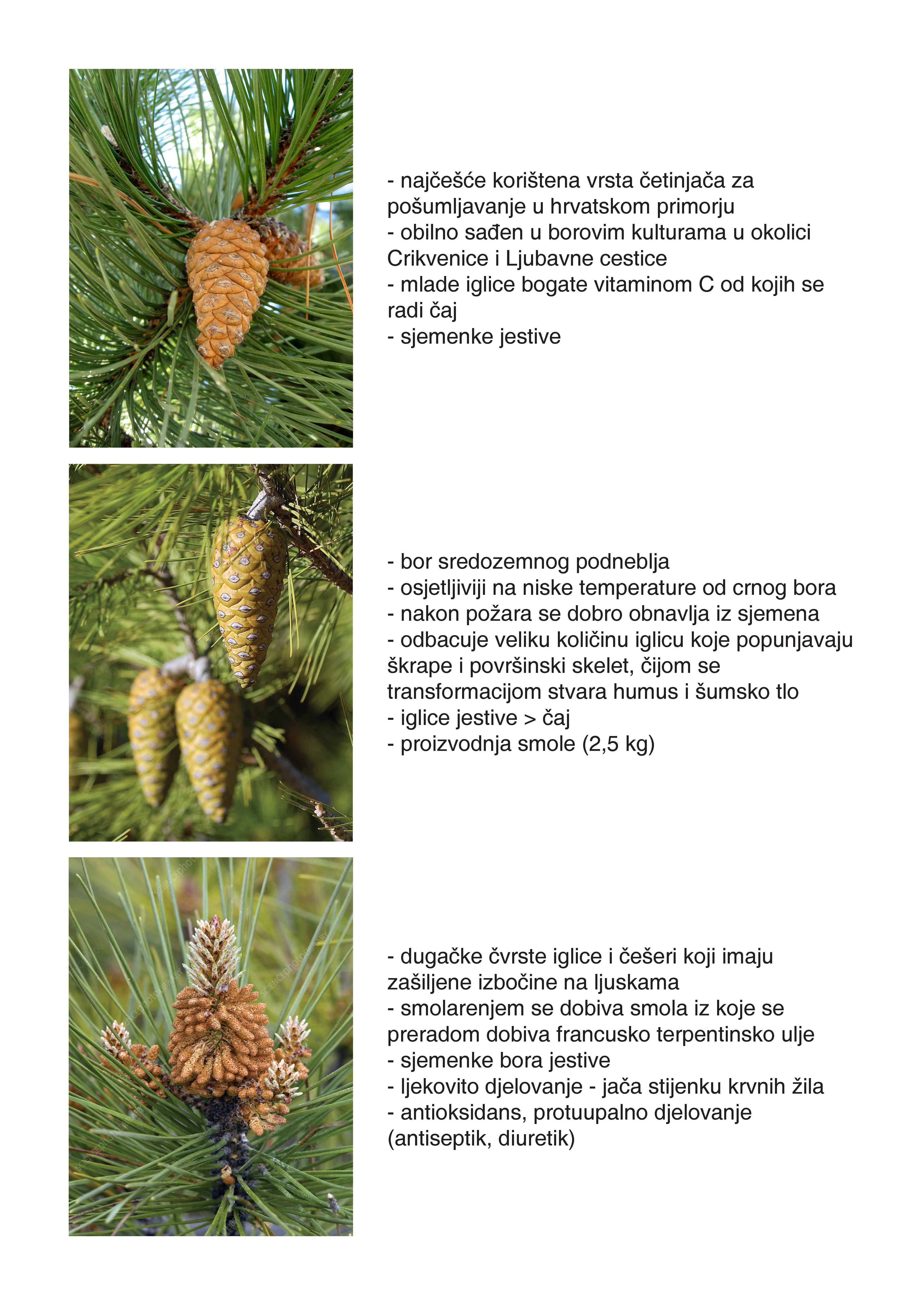
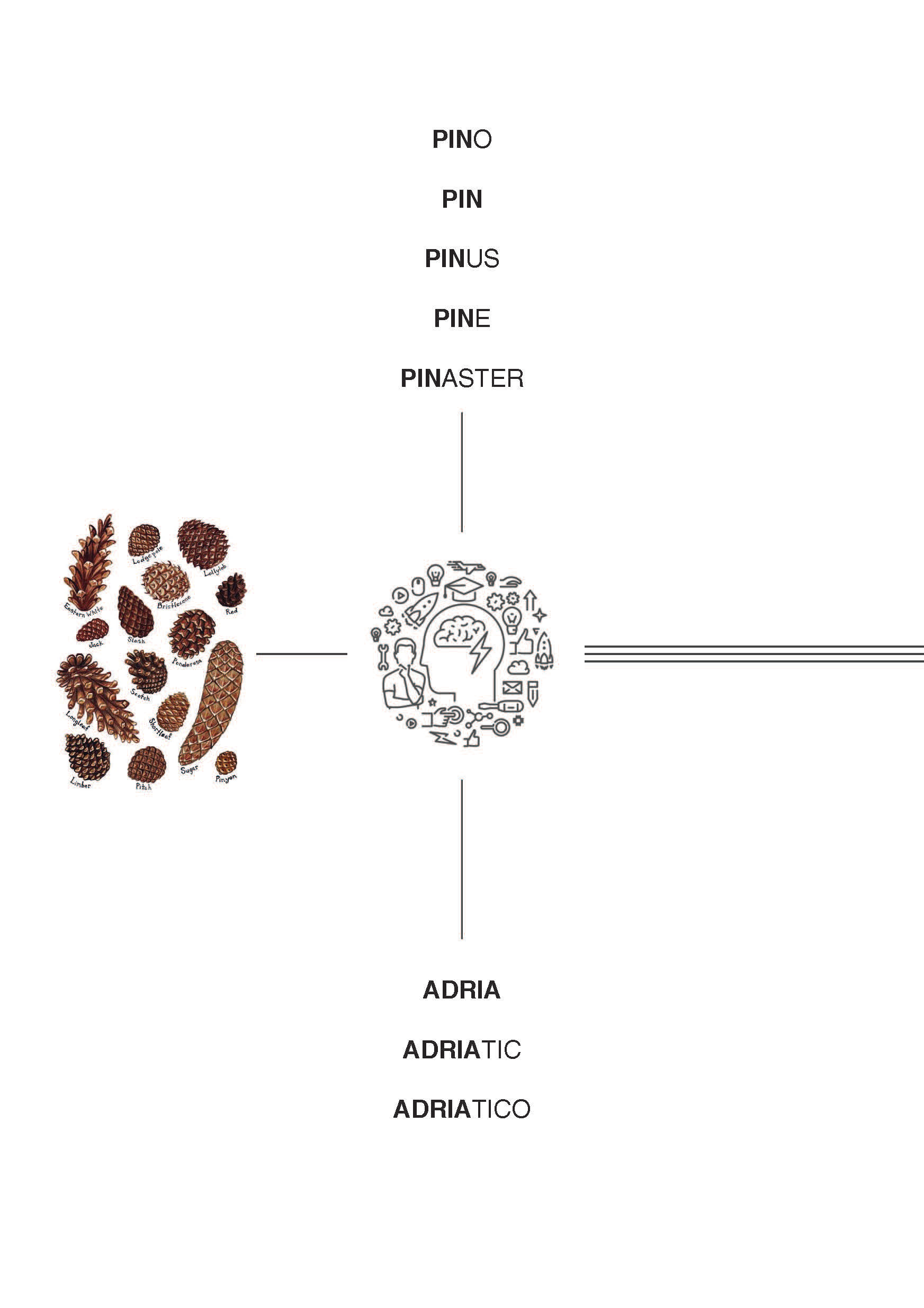
The book was imagined as a thoughtful process, where the listeners (the board of directors) were supposed to write the new company name on the line of the first page. After an extended research of history, culture and vegetation of Riviera Crikvenica, I proposed a name Pinadria, which derives from a widespread tree of 'Pine' in the area along with the word 'Adria', which stands for Adriatic Sea. The new corporate logo was applied to business cards, memorandum, A4 case, letter and samples of merchandising.


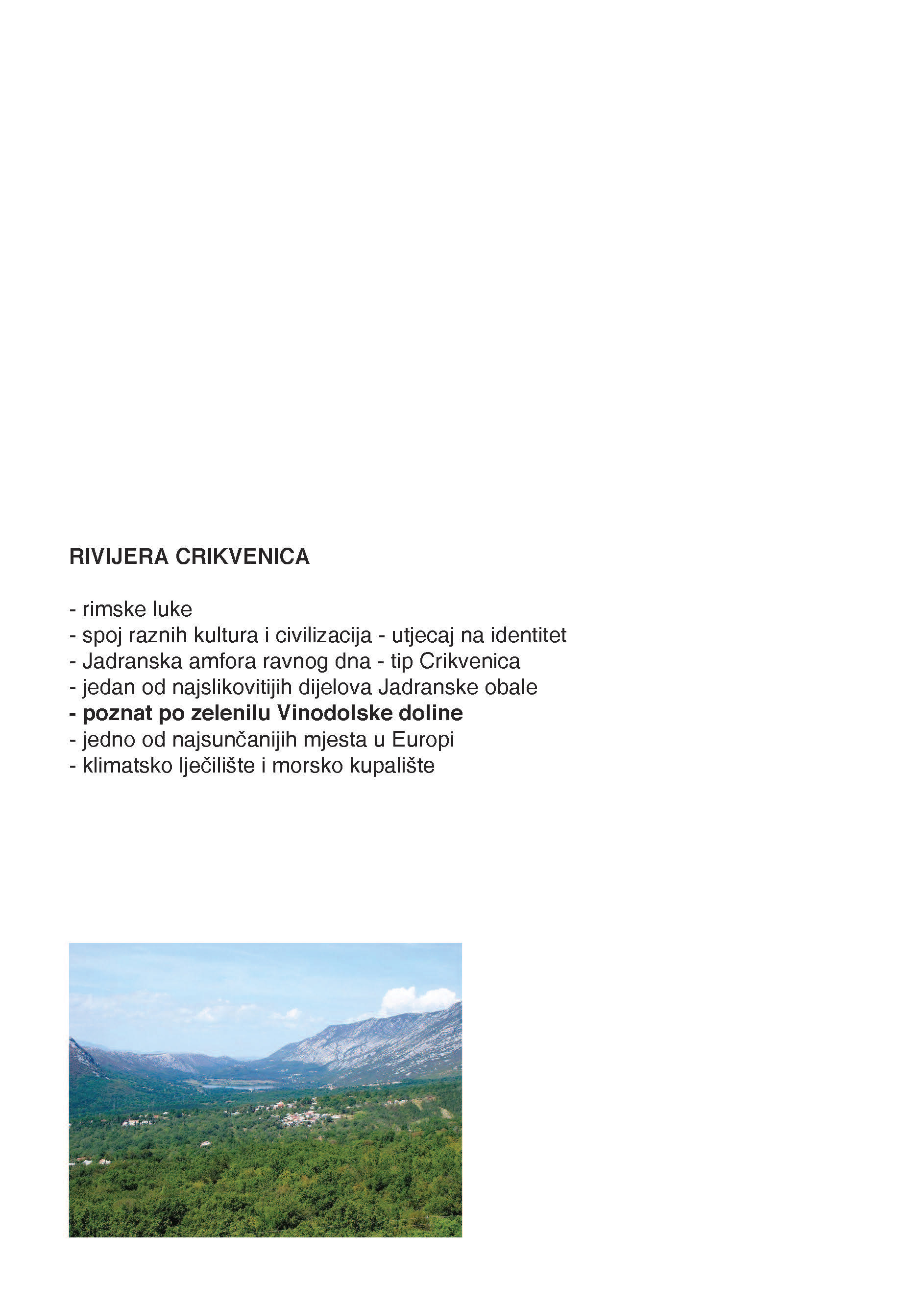
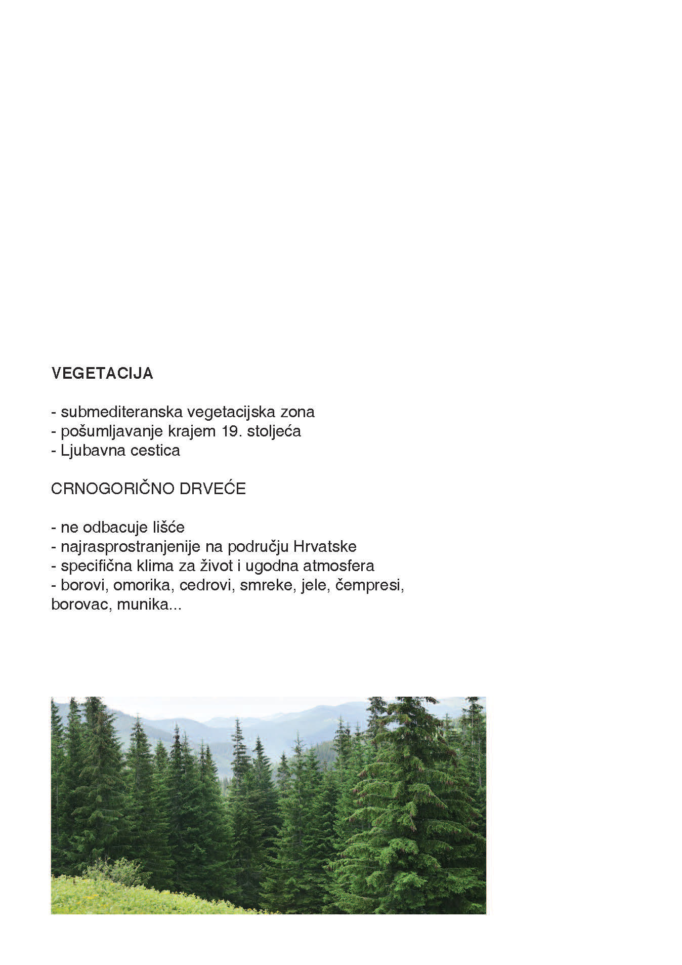
RESEARCH
LOGO PROPOSAL
LOGO PROPOSAL
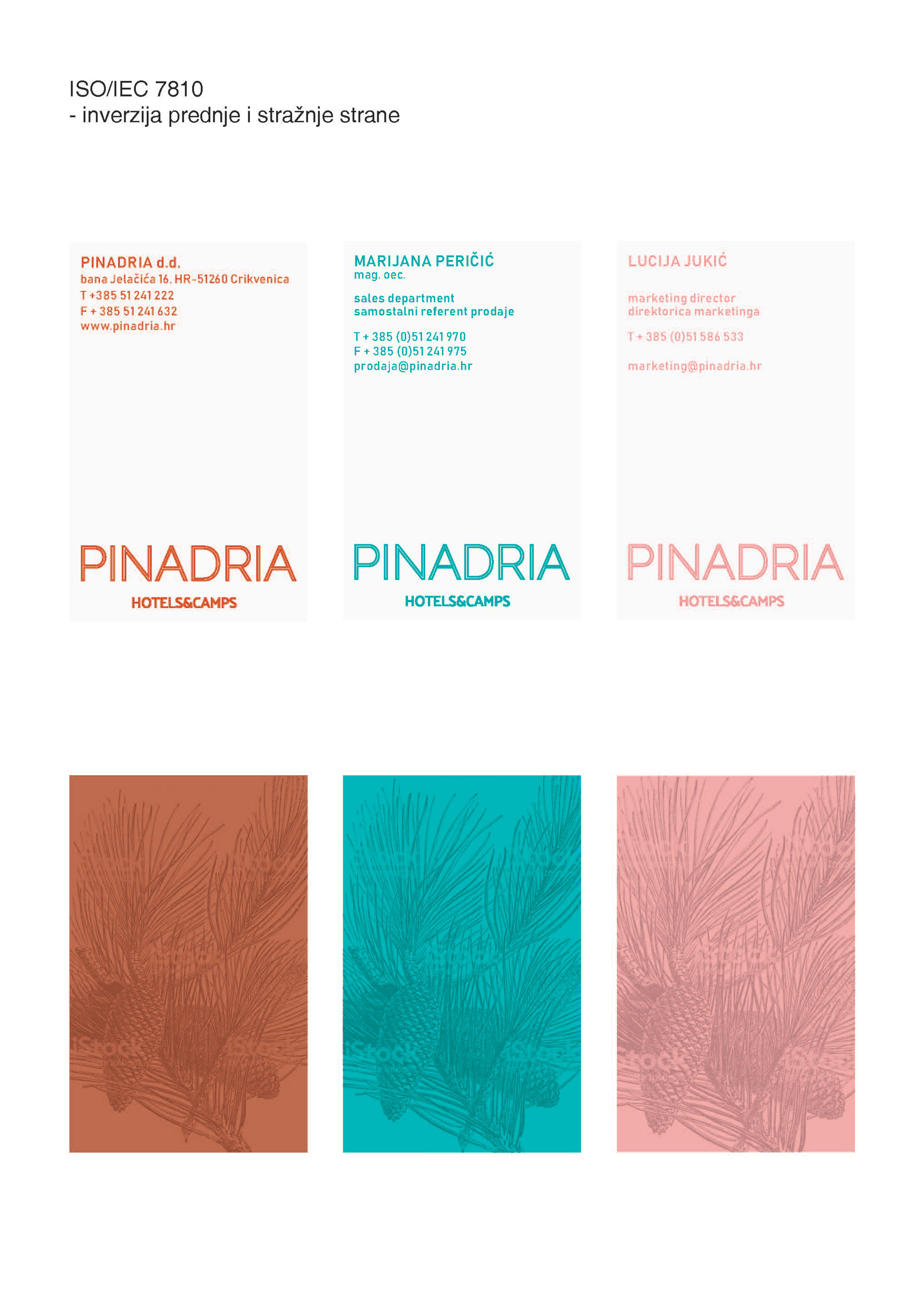
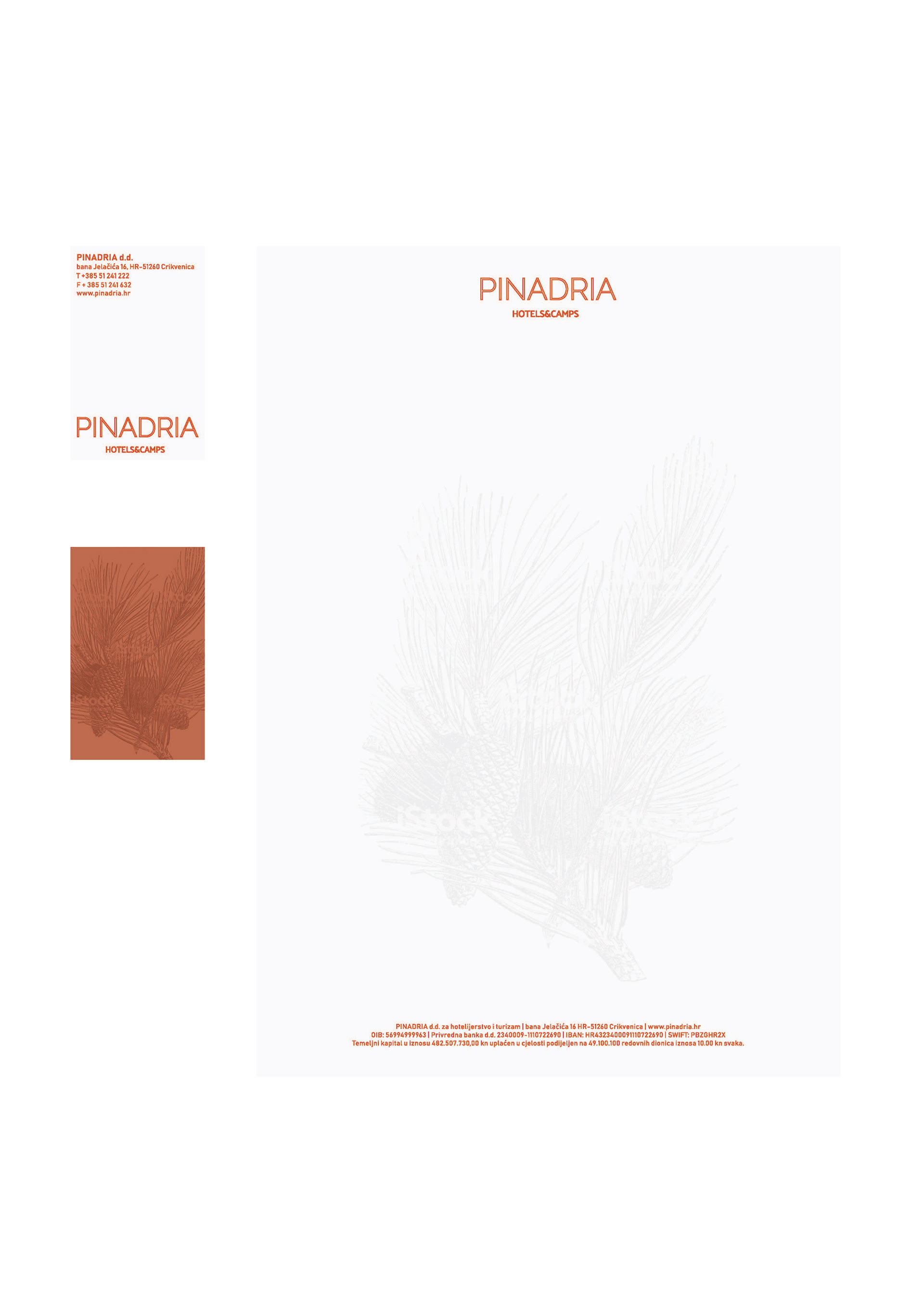
CORPORATE CARDS
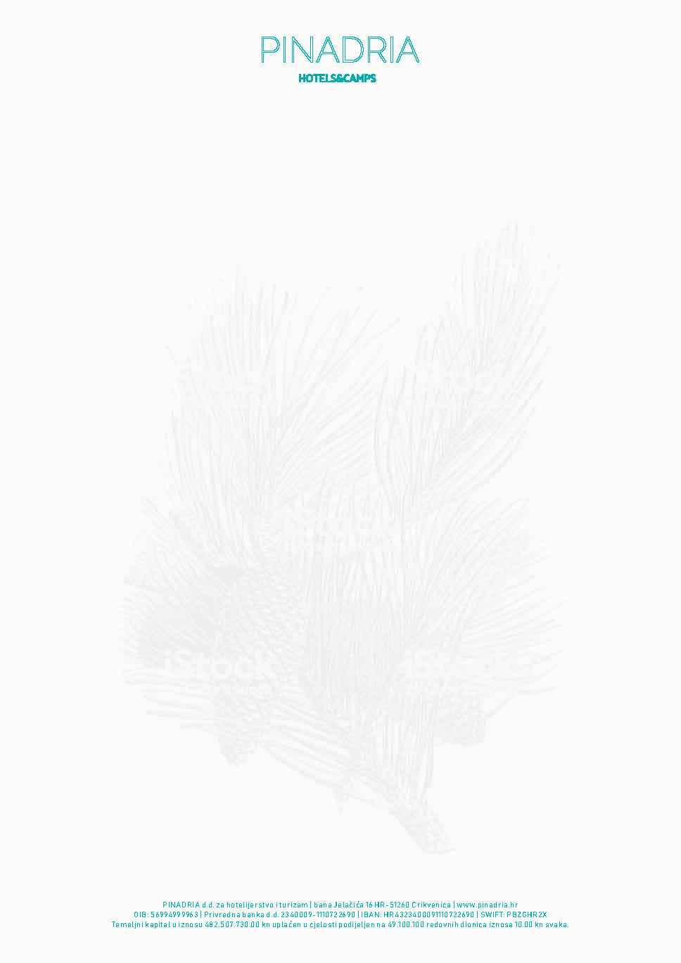
MEMORANDUM
CORPORATE CASE
LETTER
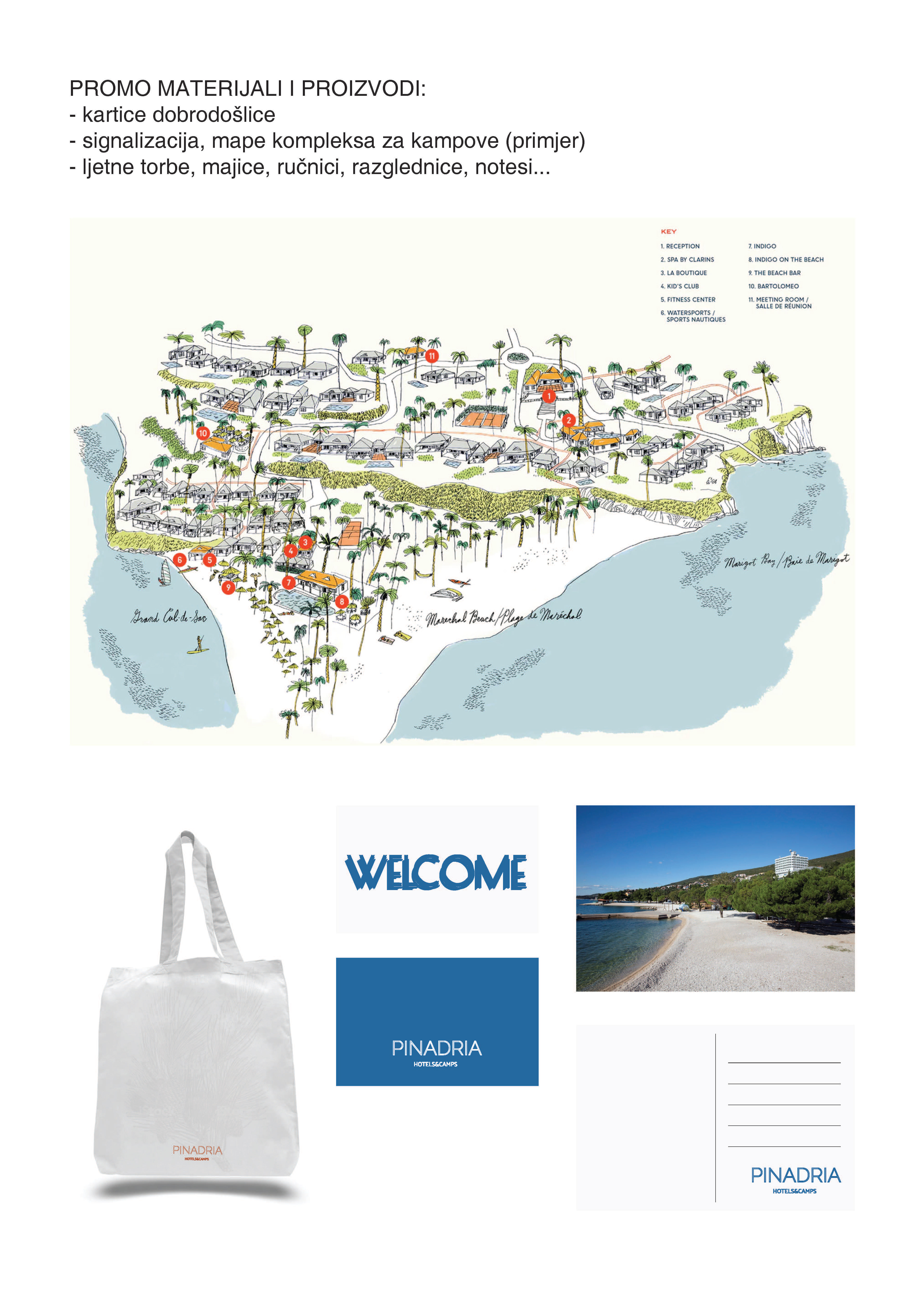
MERCHANDISING
The research board