LOPTA - FINAL PROJECT
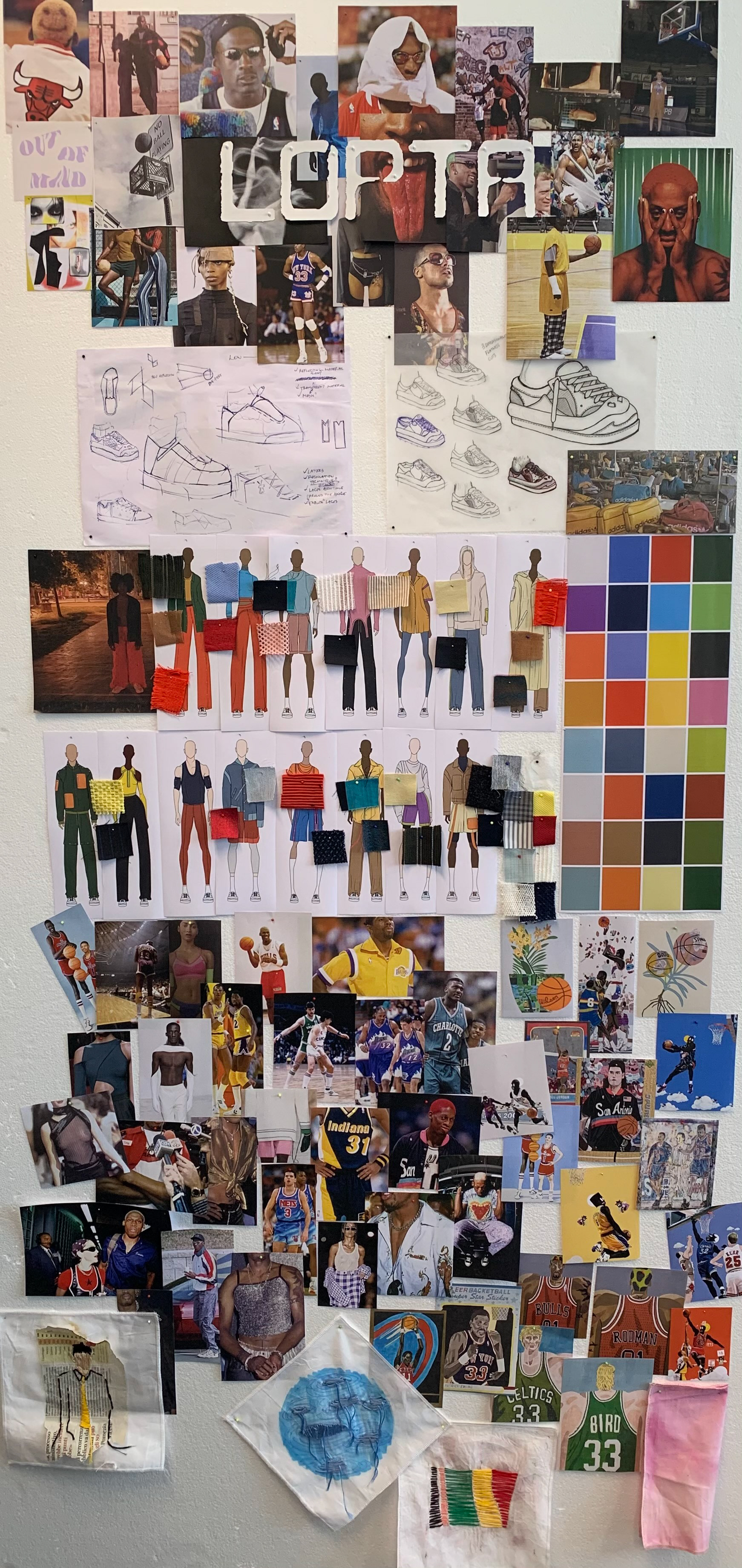
For the final project/exam at Master course in Creative Direction at Polimoda we were asked to create our own brand. On the market saturated with highly commercial and profit-driven leisurewear brands comes the need of seeing basketball in a new, refreshing cultural context. The result was a 144-page concept book which covered the brand concept & DNA, brand manifesto, collection line up and merchandising plan, brand positioning, visual language, etc. and finally launching event.
1ST PAGE OF THE BOOK
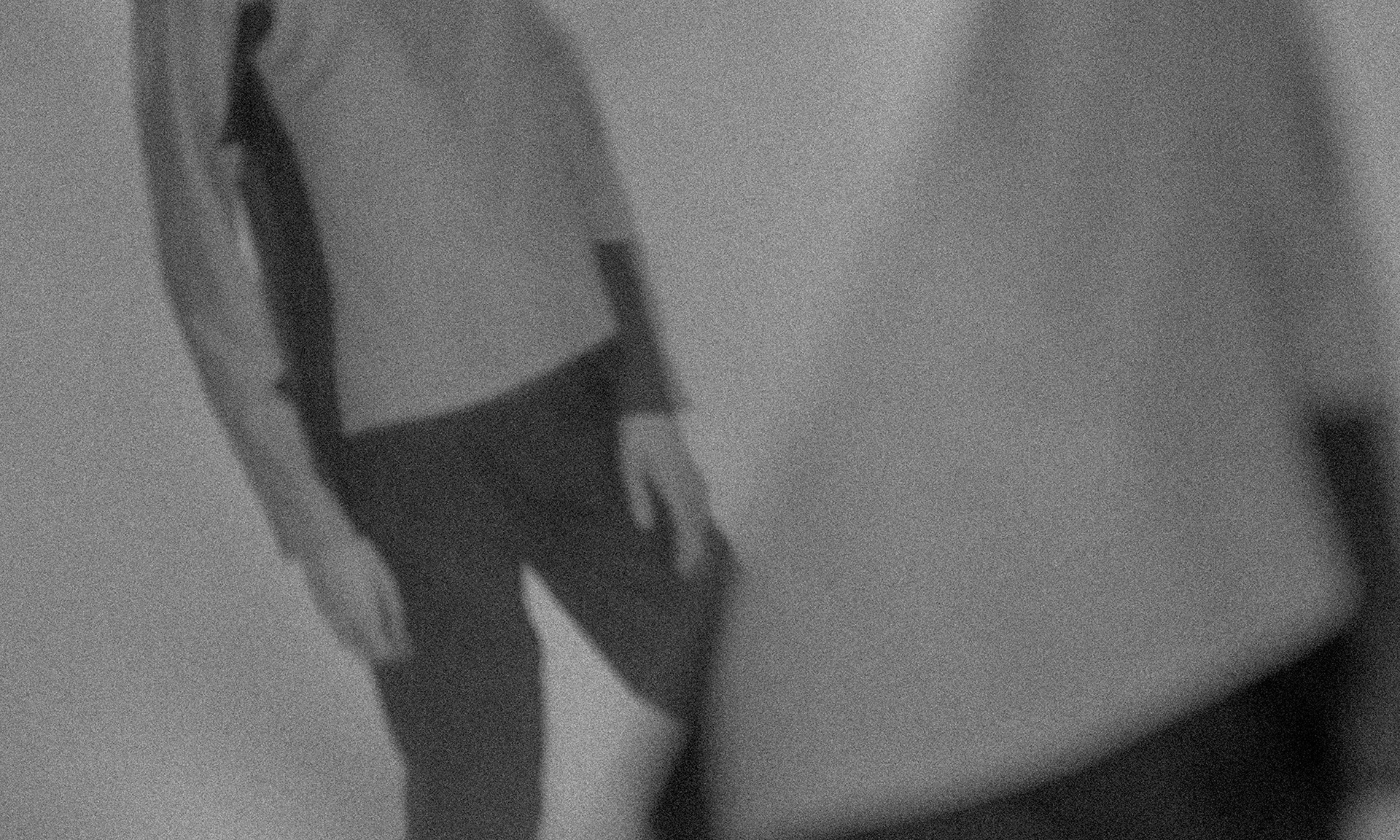
DENNIS RODMAN AND A PHOTO OF YOUNG ME
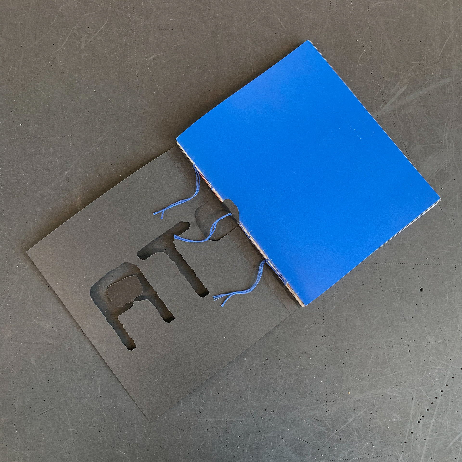
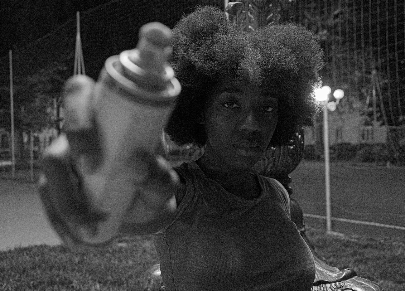
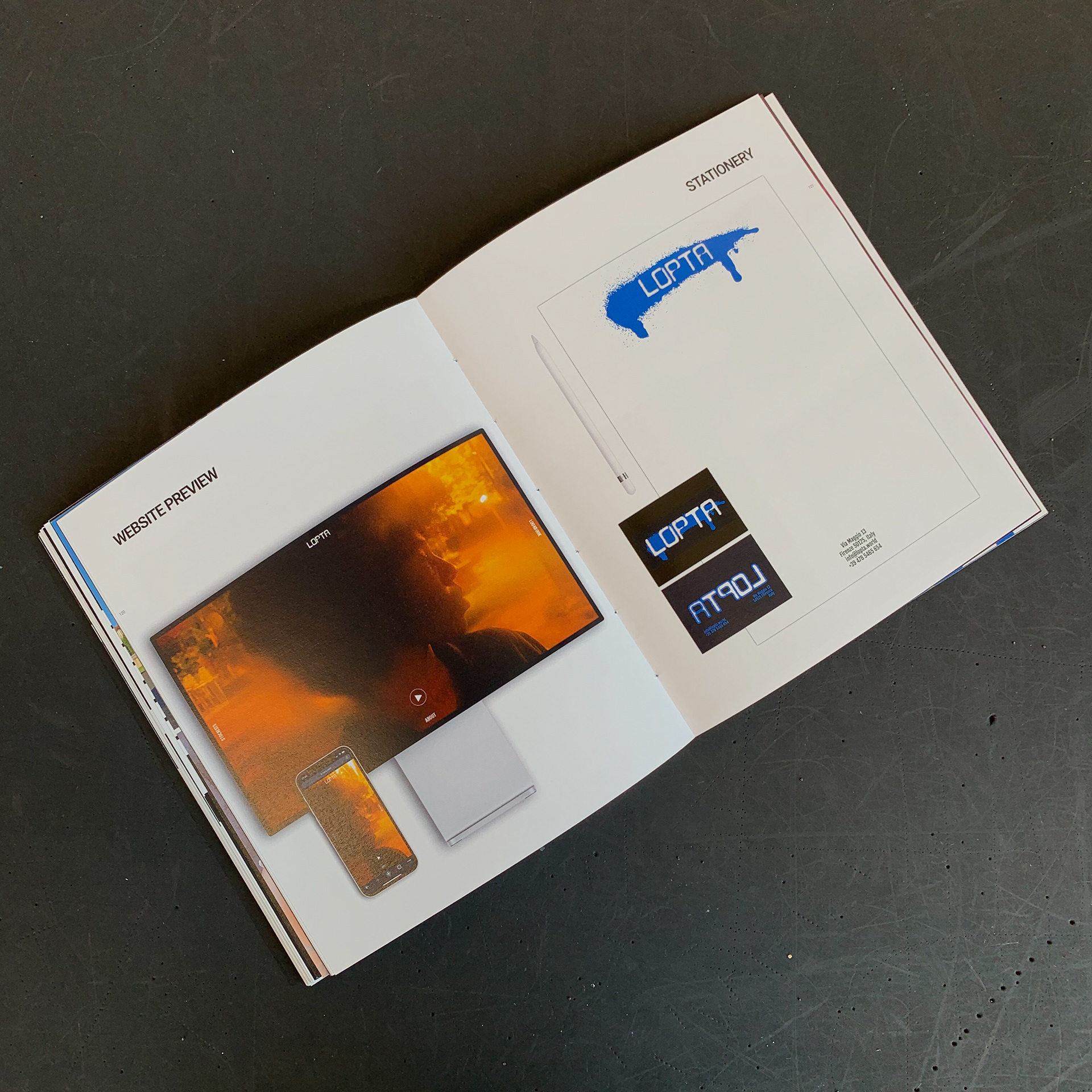
The name 'Lopta' has slavic routes. The word 'Lopta' in croatian and other languages of ex-Yugoslavia means the 'ball', a round object with various uses. The word 'lopta' derives from the preslavic verb lopati/lapati/lopiti meaning to hit, to strike. The brand name is following the concept of uncertainty on which Lopta is based on. The aesthetic of the logo arrives from the street art and underground culture, therefore logo was adapted so that it could be used as a stencil.
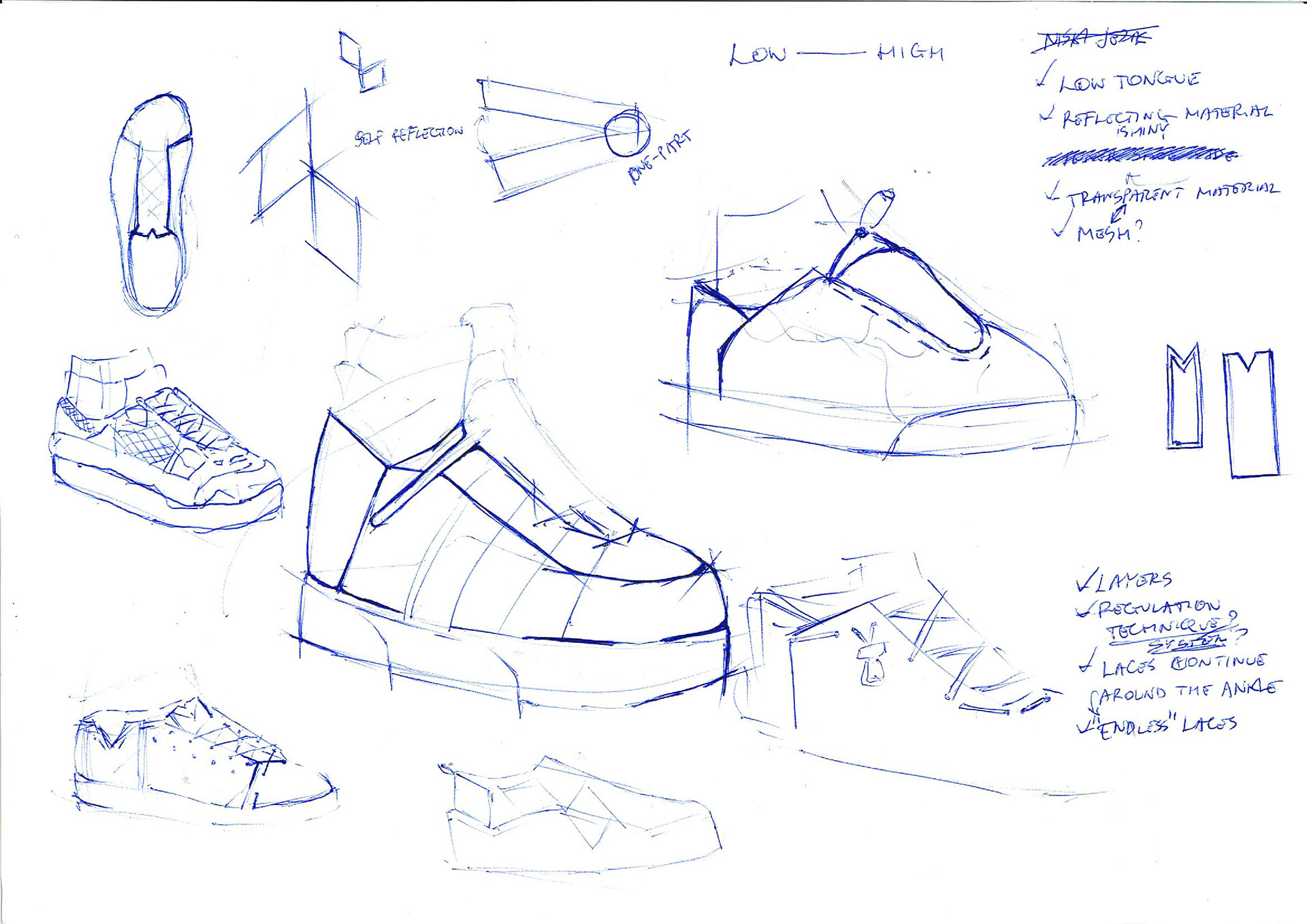
FIRST SKETCHES, CONCEPT DEVELOPMENT
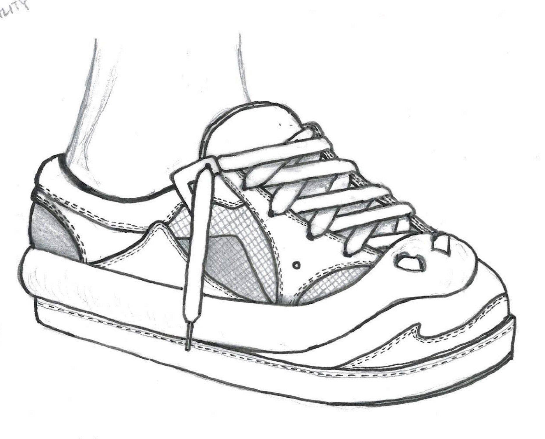
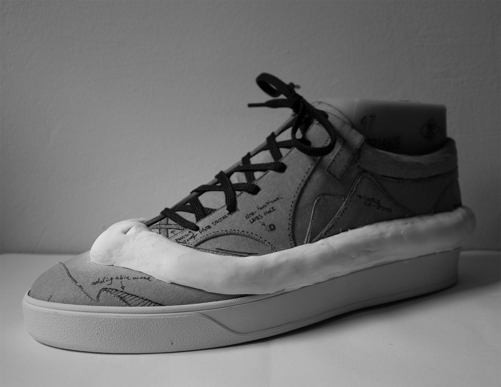
DETAILED SKETCH, SIDE VIEW
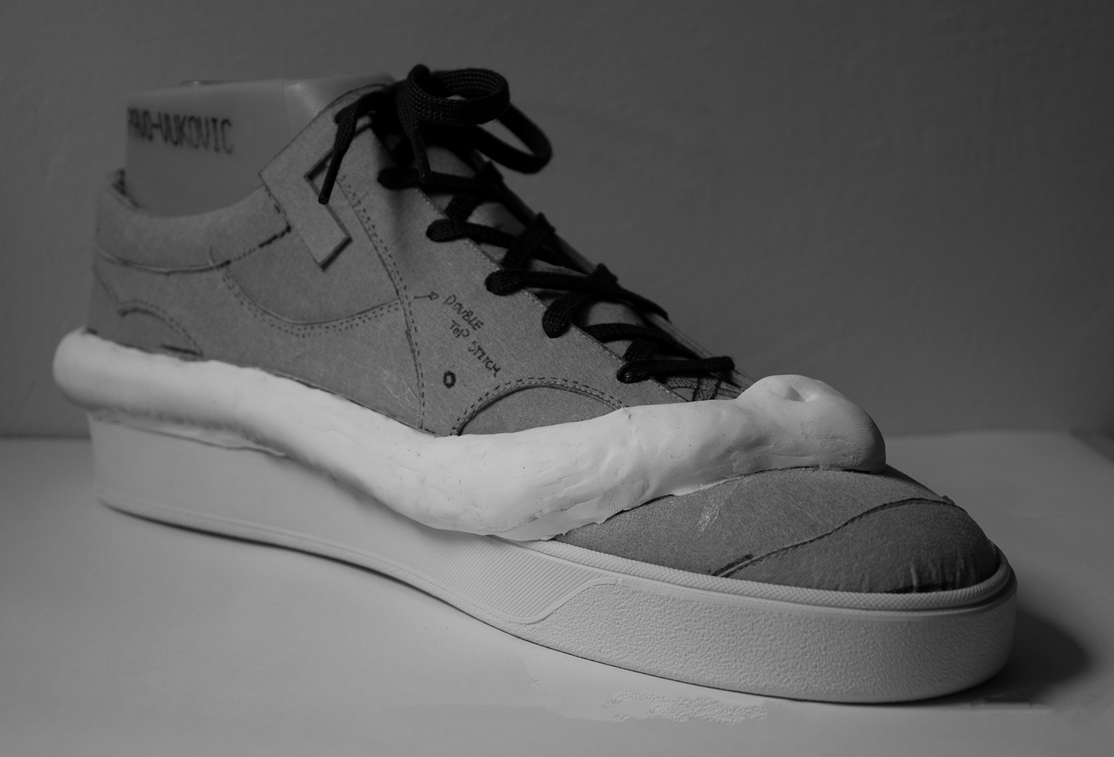
The sneakers which I designed and developed with ex-Polimoda student Du Yun were a part of the launching collection 'One-two punch'. The sneakers follow the same concept, the initial idea of communication between different proportions and volumes, furthermore how they can swimmingly function together.
SIDE VIEW
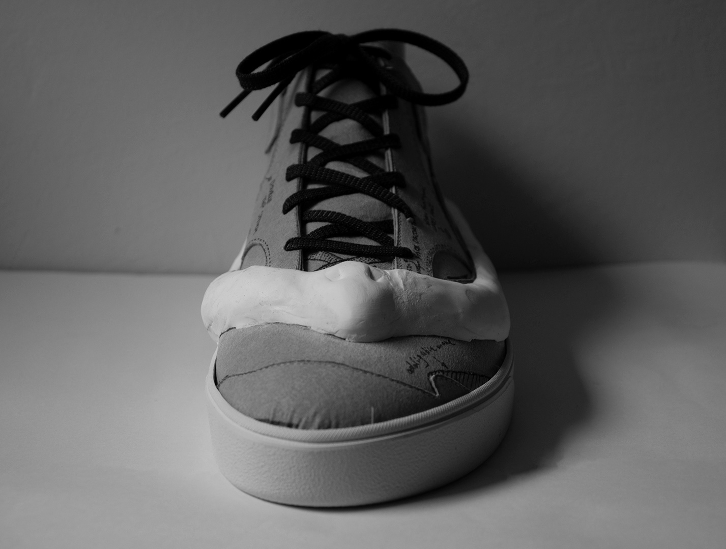
FRONT VIEW
INNER SIDE VIEW
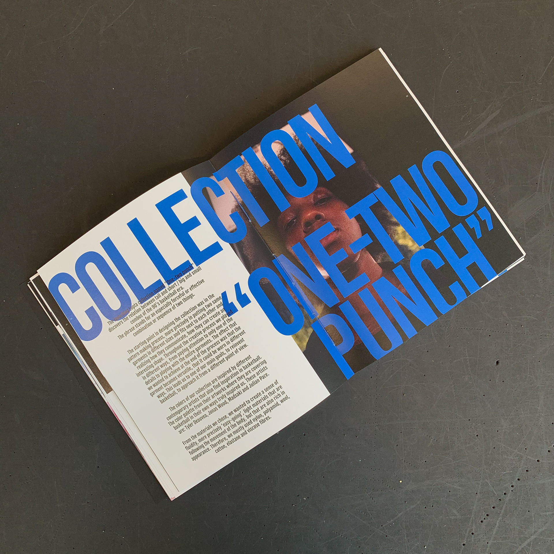
The launching Lopta collection named 'One-two punch' discovers the relation between tall and short / big and small combos of the 90's basketball era. The phrase stands for an especially forceful or effective combination or sequence of two things.
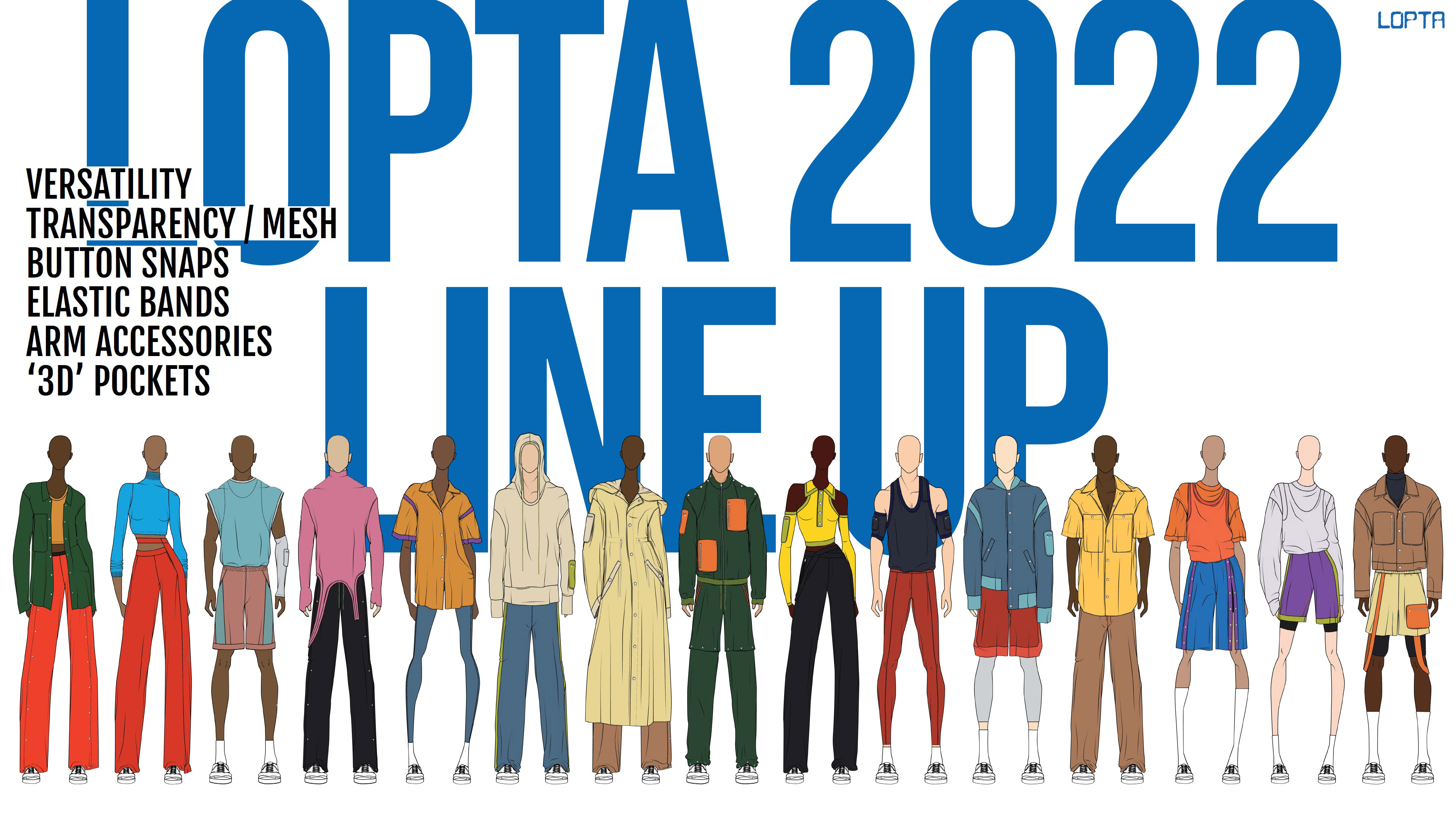
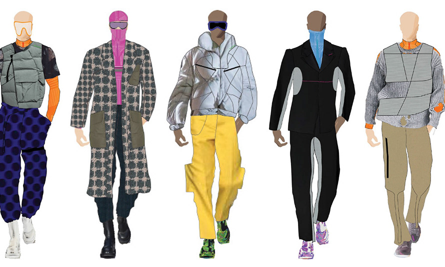
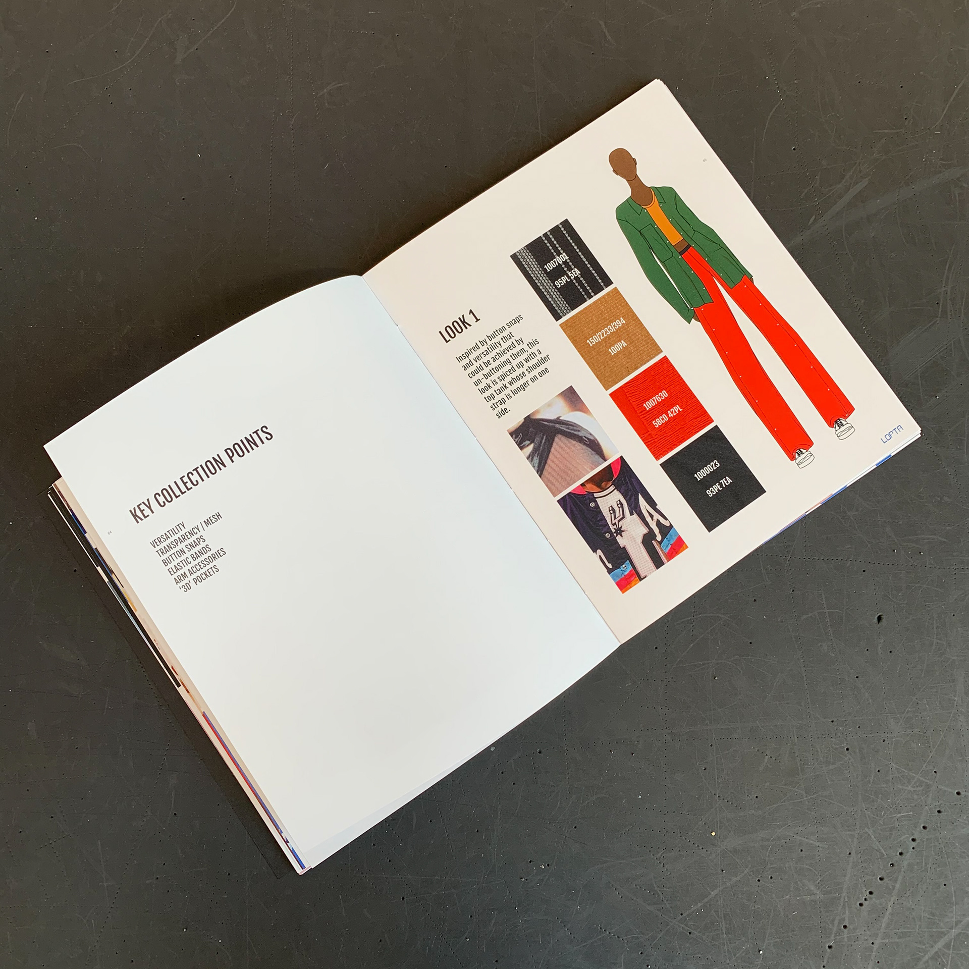
KEY COLLECTION POINTS AND A LINE UP
The starting point in designing the collection was in the pattern making process, more precisely in putting two same garments in different sizes and fits next to each other and realizing how they communicate, how they can create an interesting shape. The effect that I wanted to achieve at the end was that the garment becomes versatile, that it could be worn in different ways.
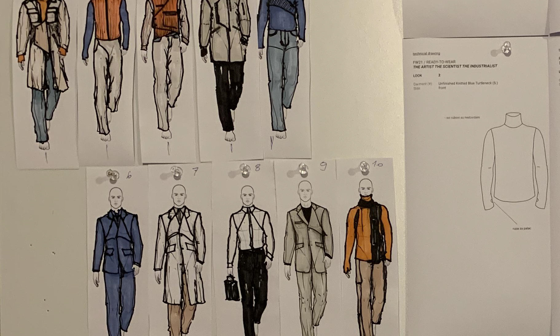
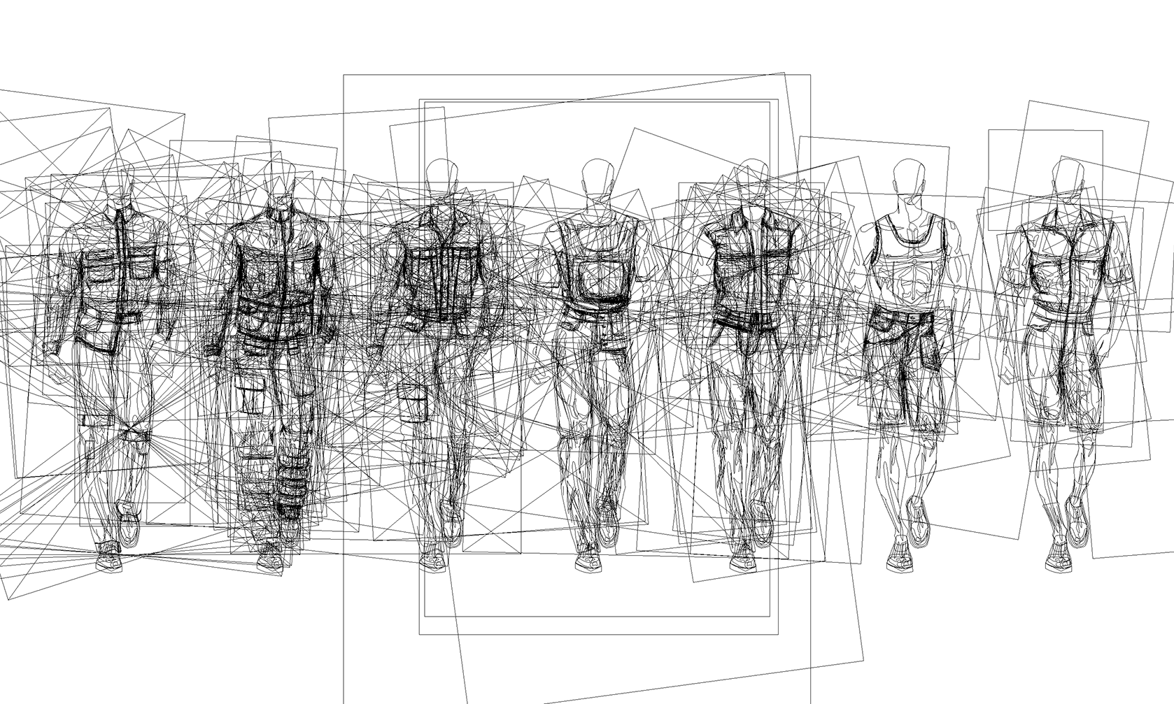
CHAPTER ON COLLECTION
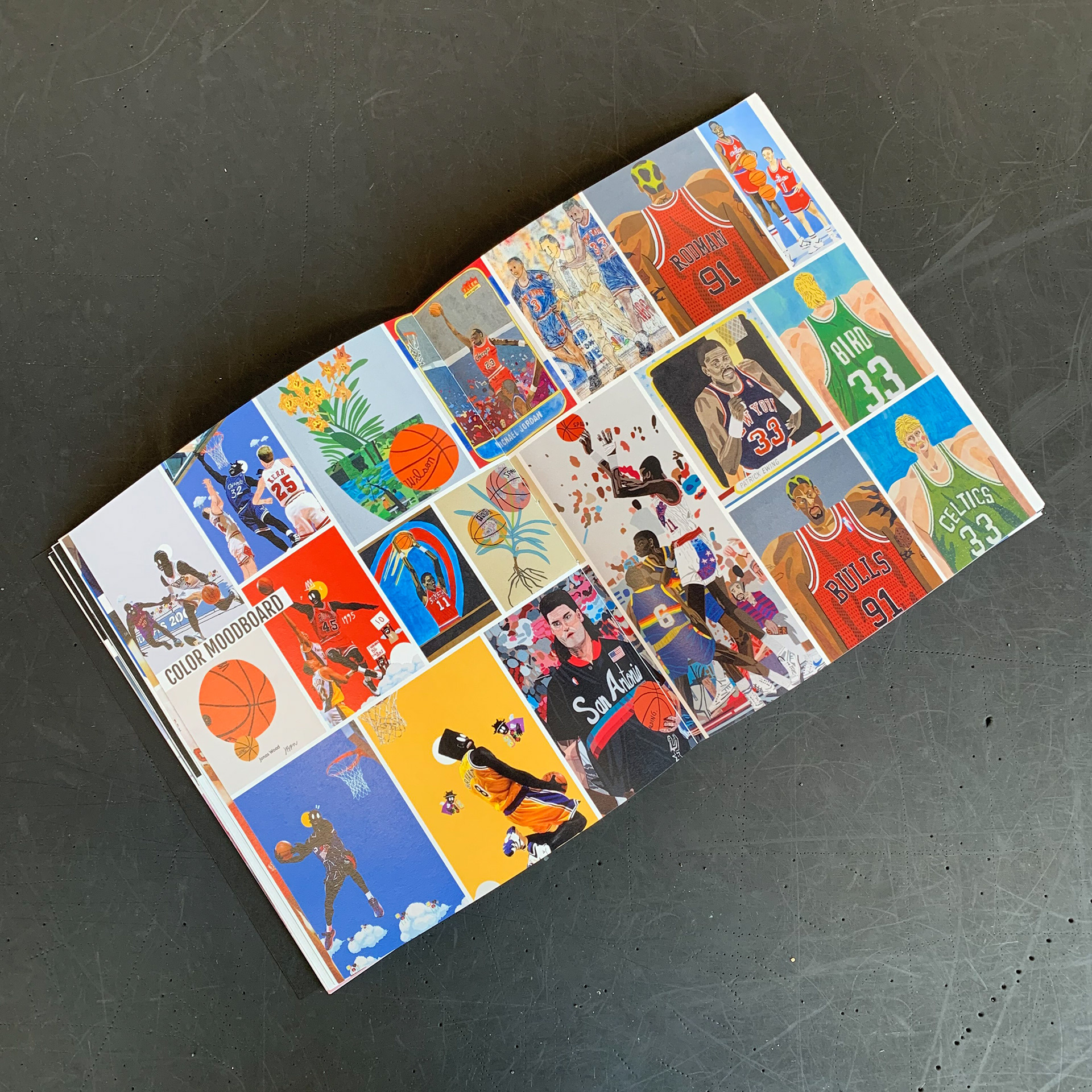
COLOR MOODBOARD
LINE UP DETAILS
The colors of the collection were extracted from the paintings and works of different contemporary artists who also find inspiration in basketball. The color palette from their artworks were truly inspirational and gave the collection a vibrant and cheerful note. The names of those artists are: Tyler Deauvea, Jonas Wood, Madsaki and Julian Pace.
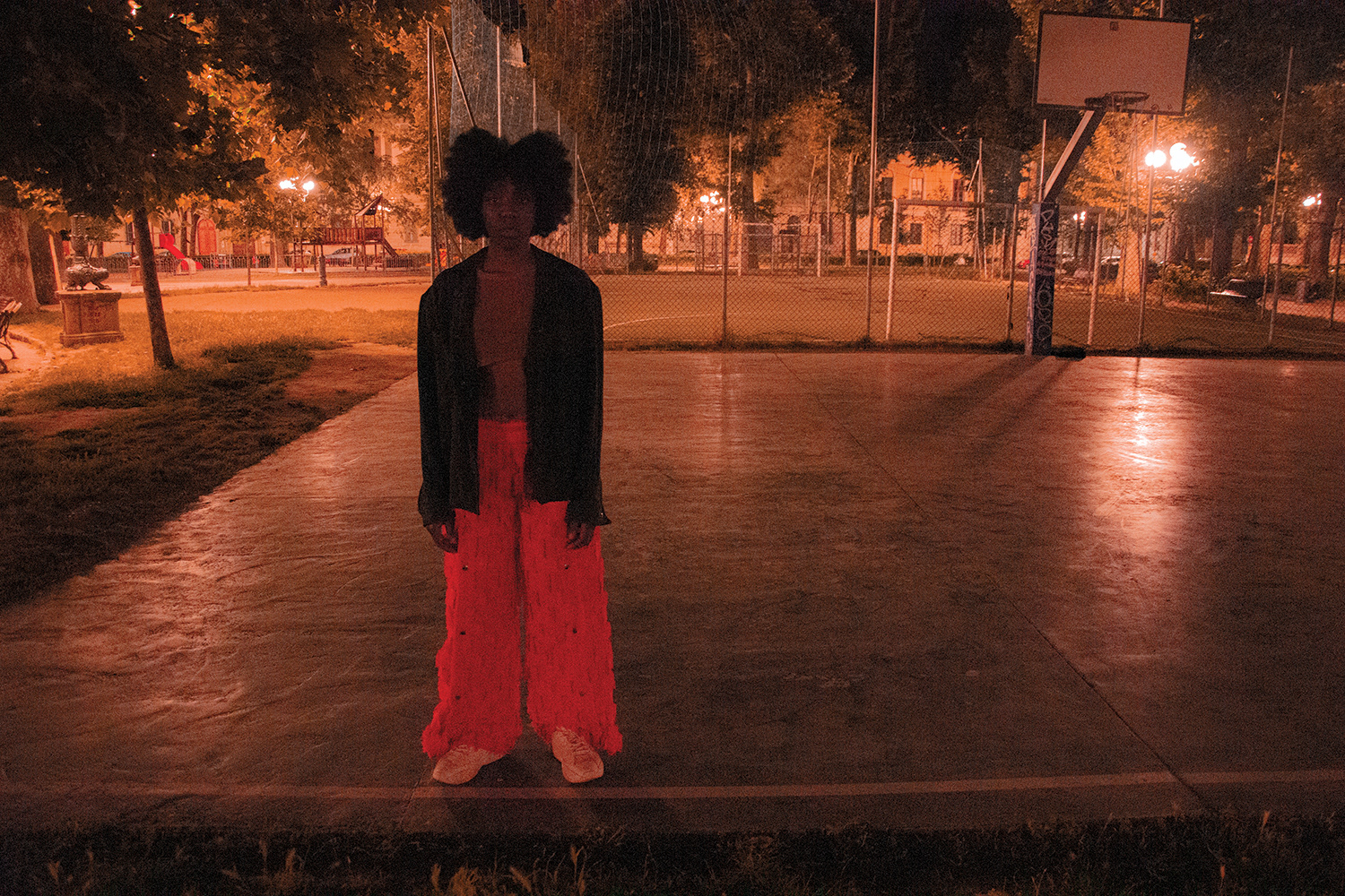
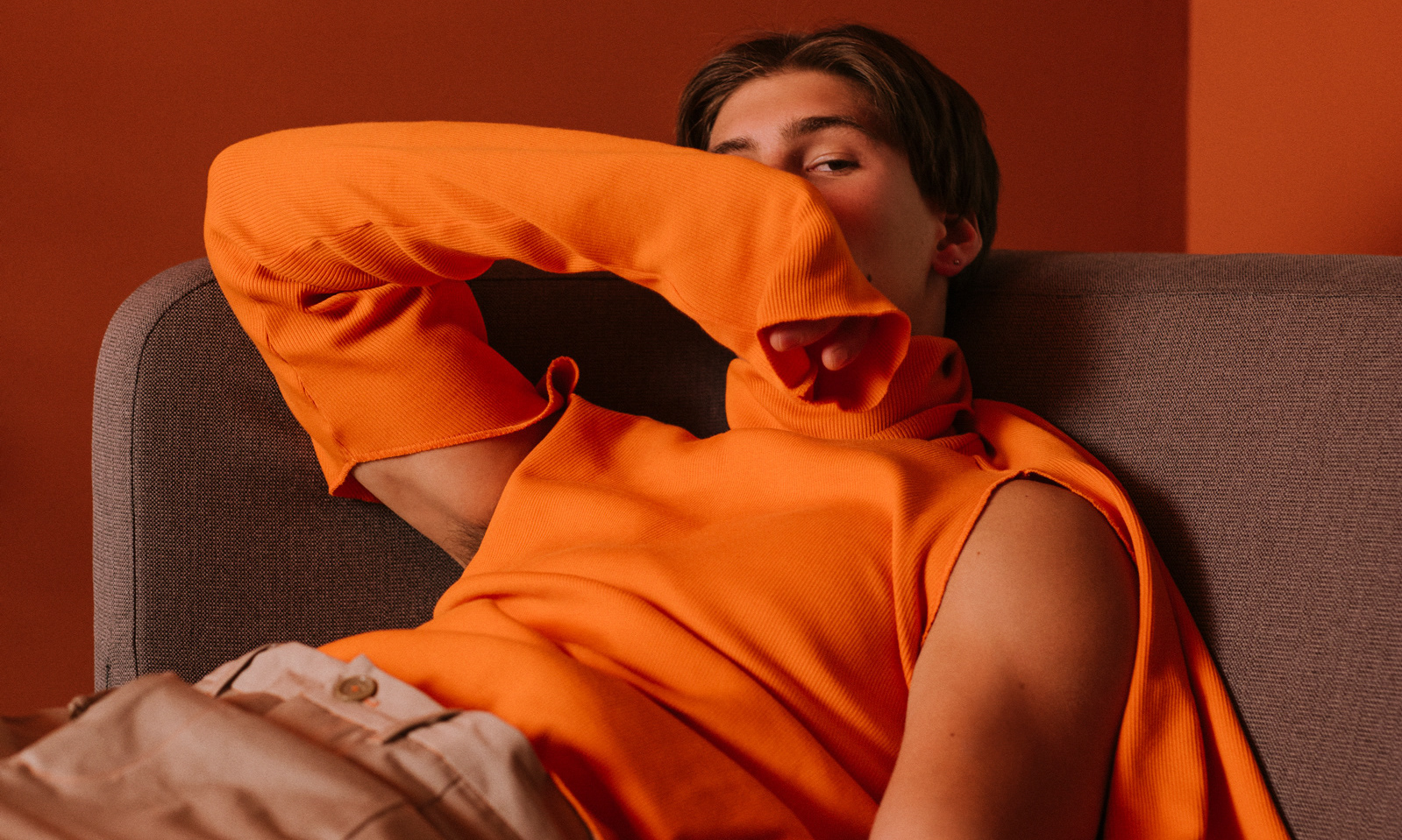
LOOK 1 - TEAR OFF PANTS, ASYMMETRICAL TANK TOP AND WARM-UP SHIRT
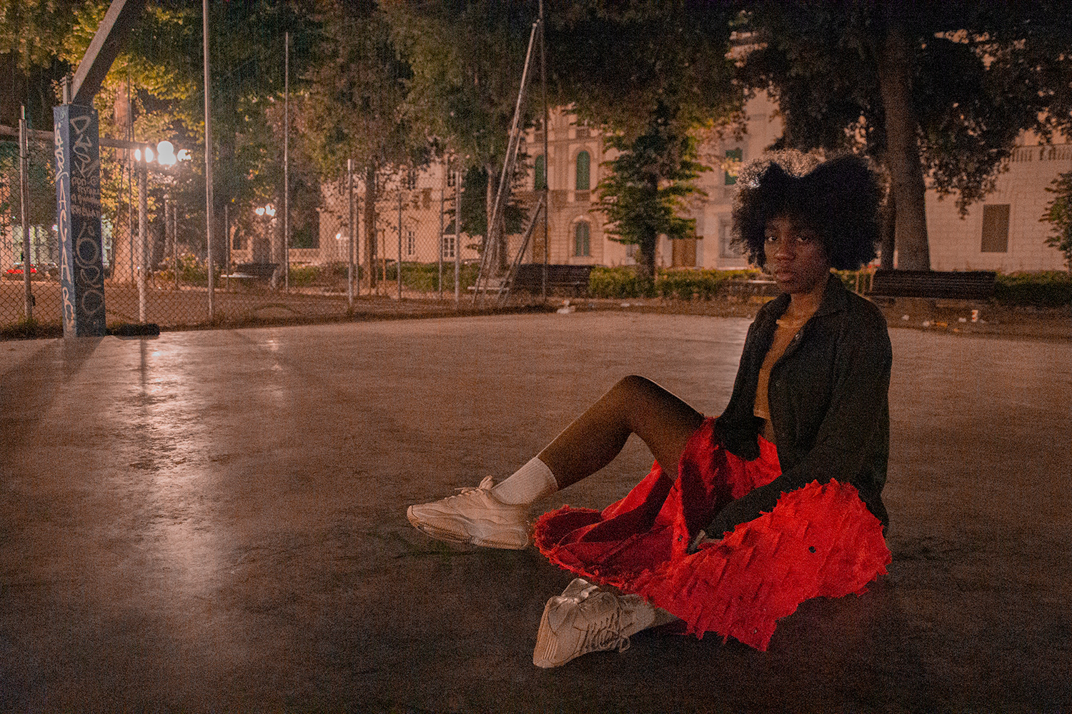
LOOK 1 - TEAR OFF PANTS, ASYMMETRICAL TANK TOP AND WARM-UP SHIRT
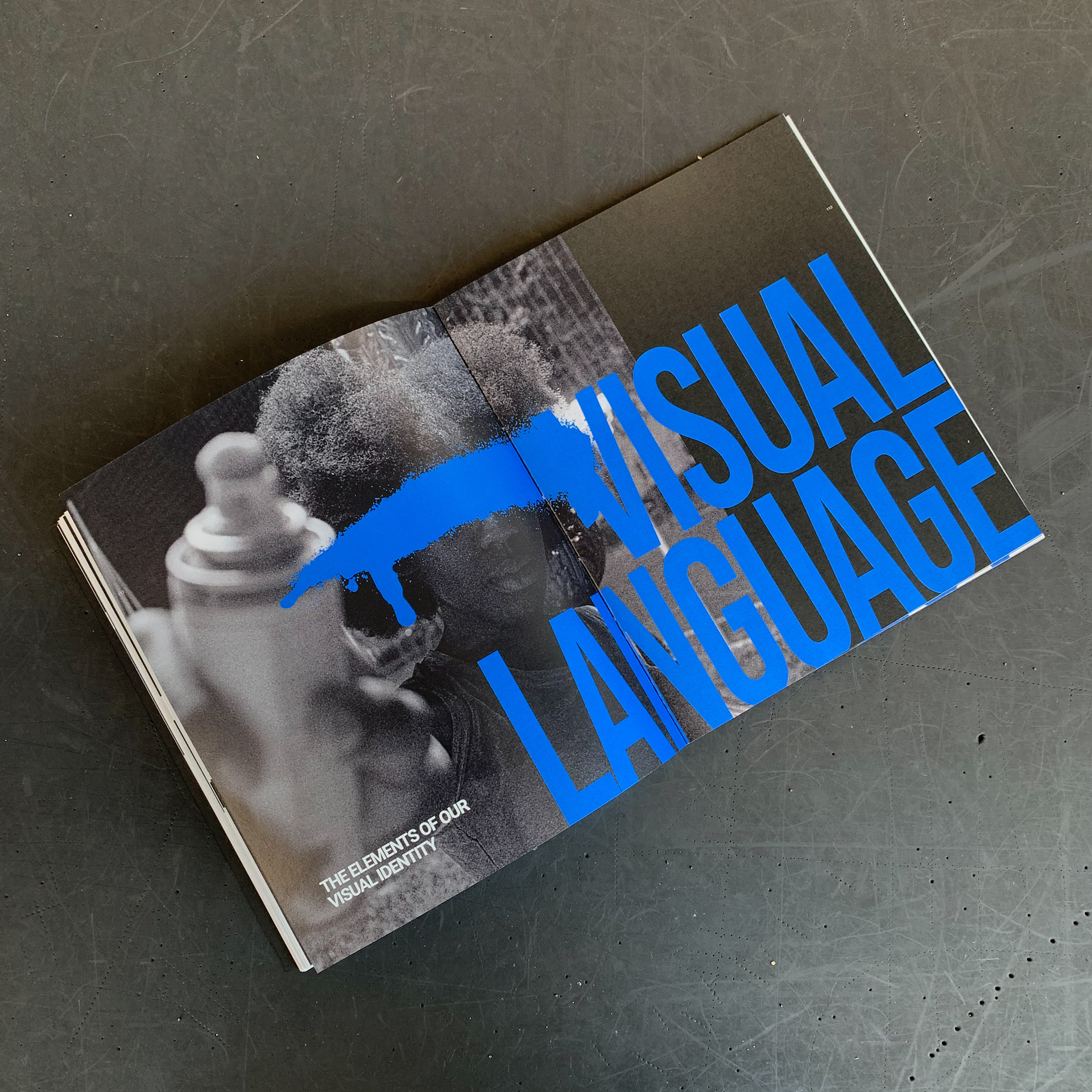
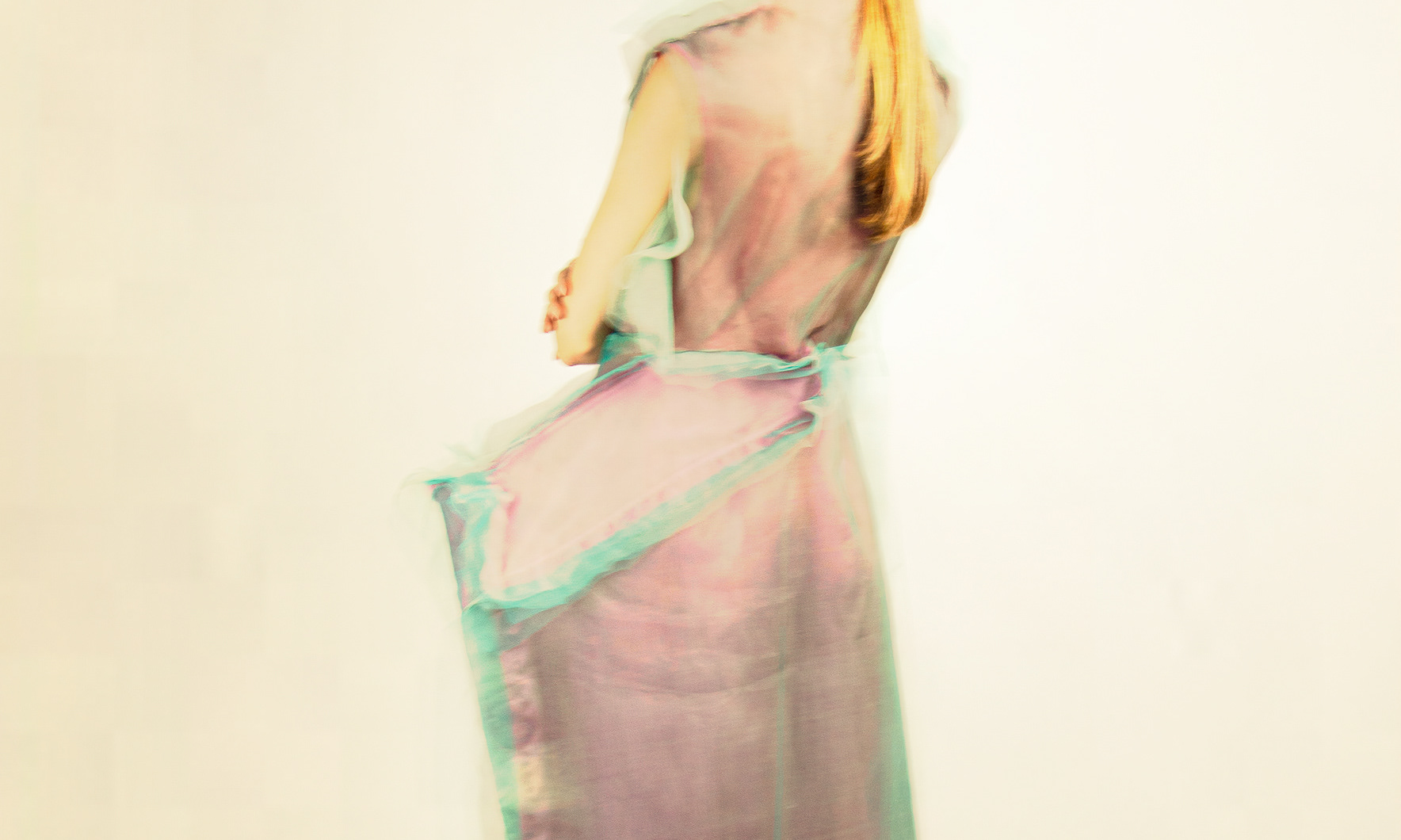
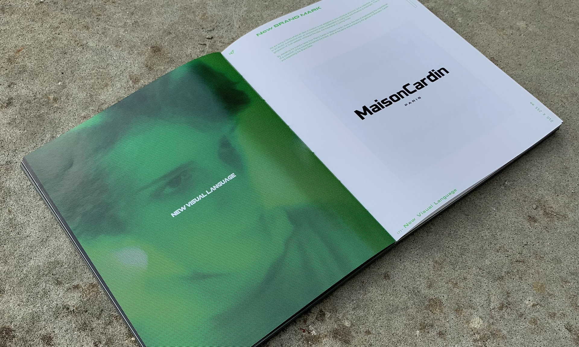
CHAPTER ON VISUAL LANGUAGE
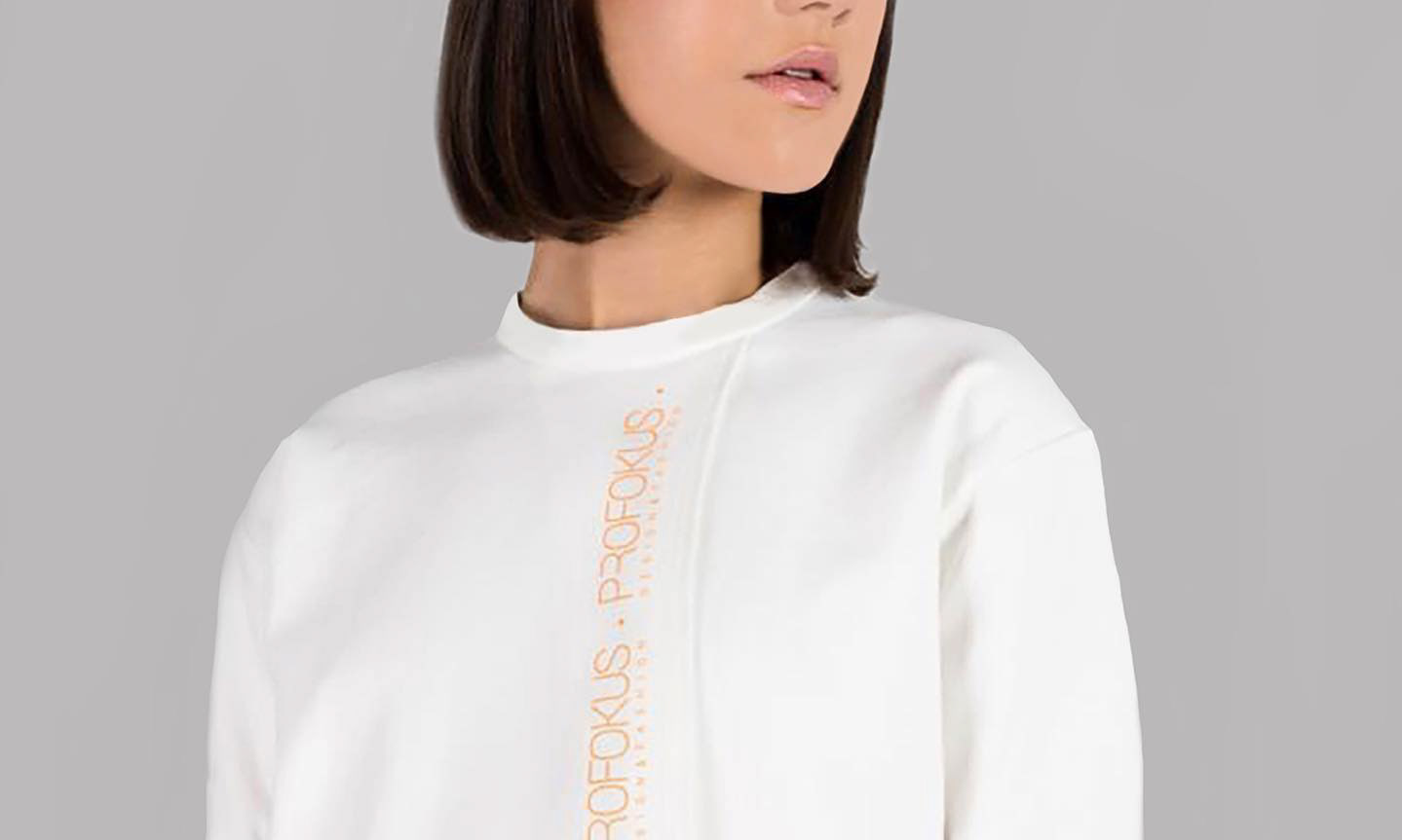
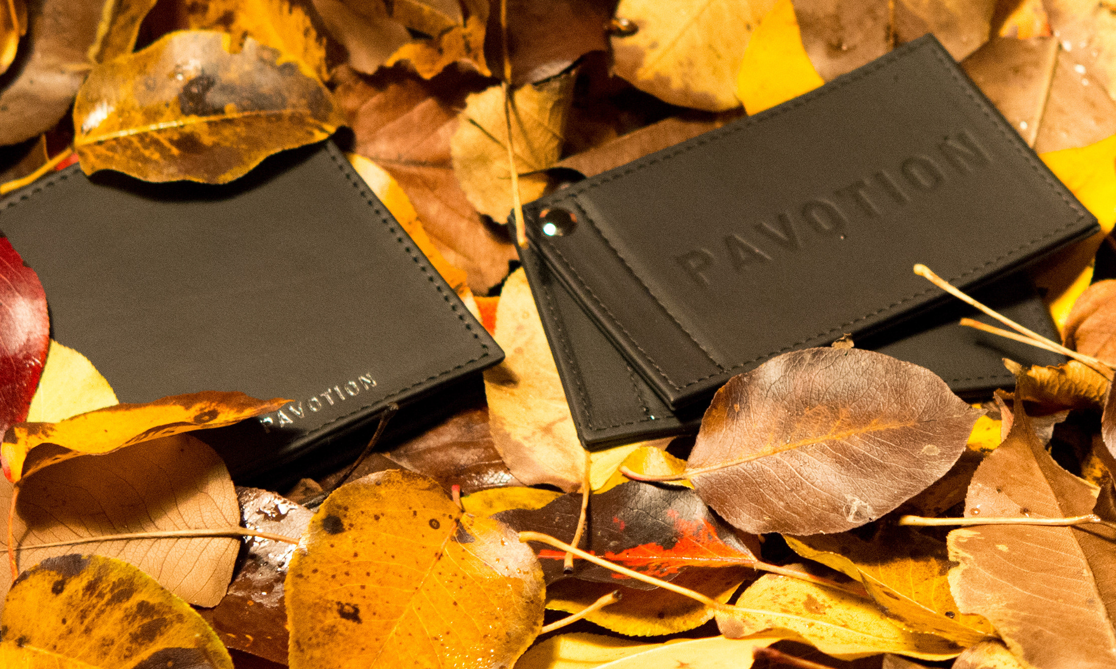
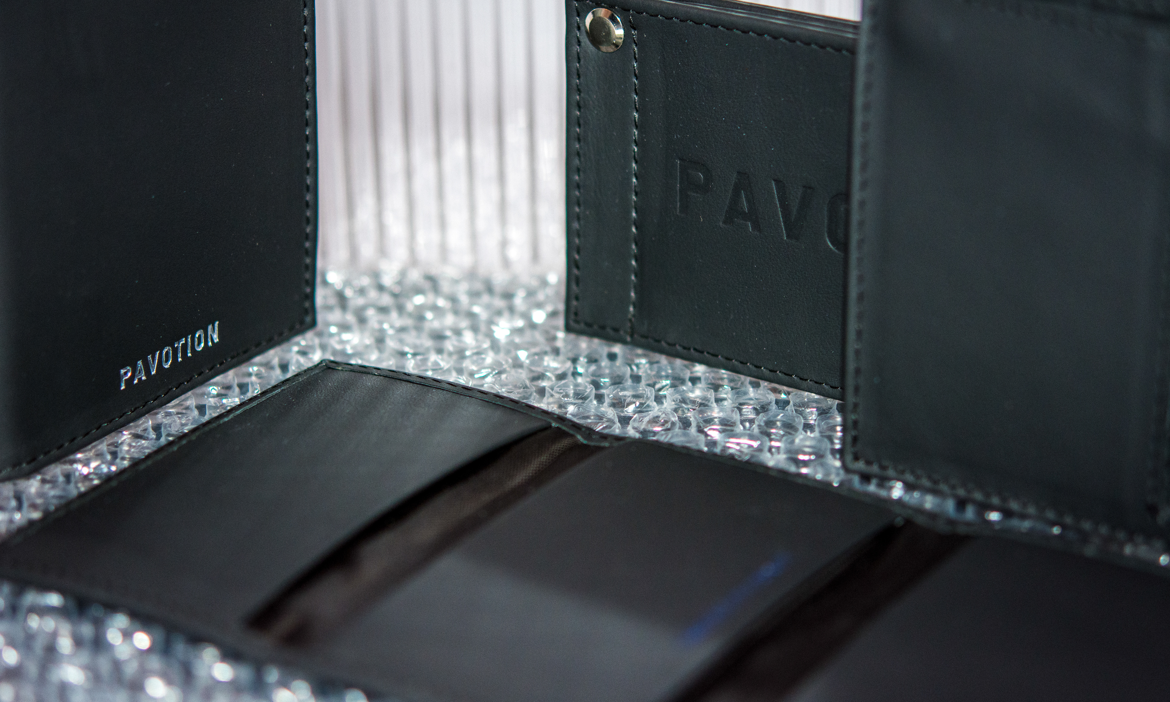
MOCKUPS
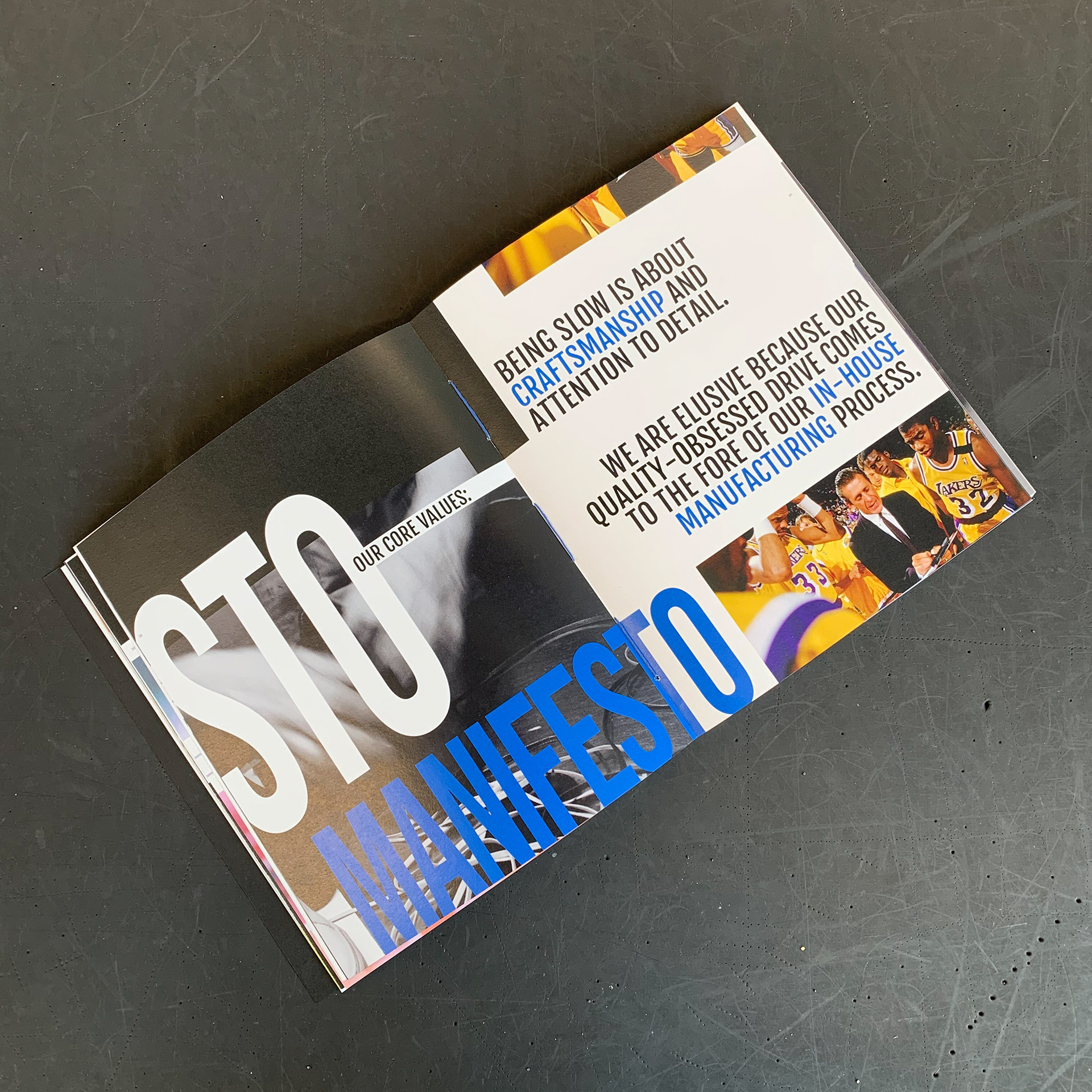
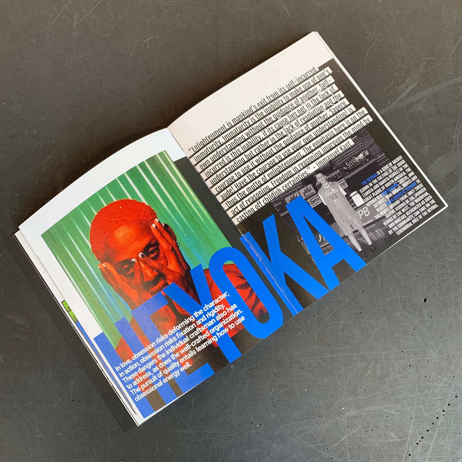
BRAND MANIFESTO
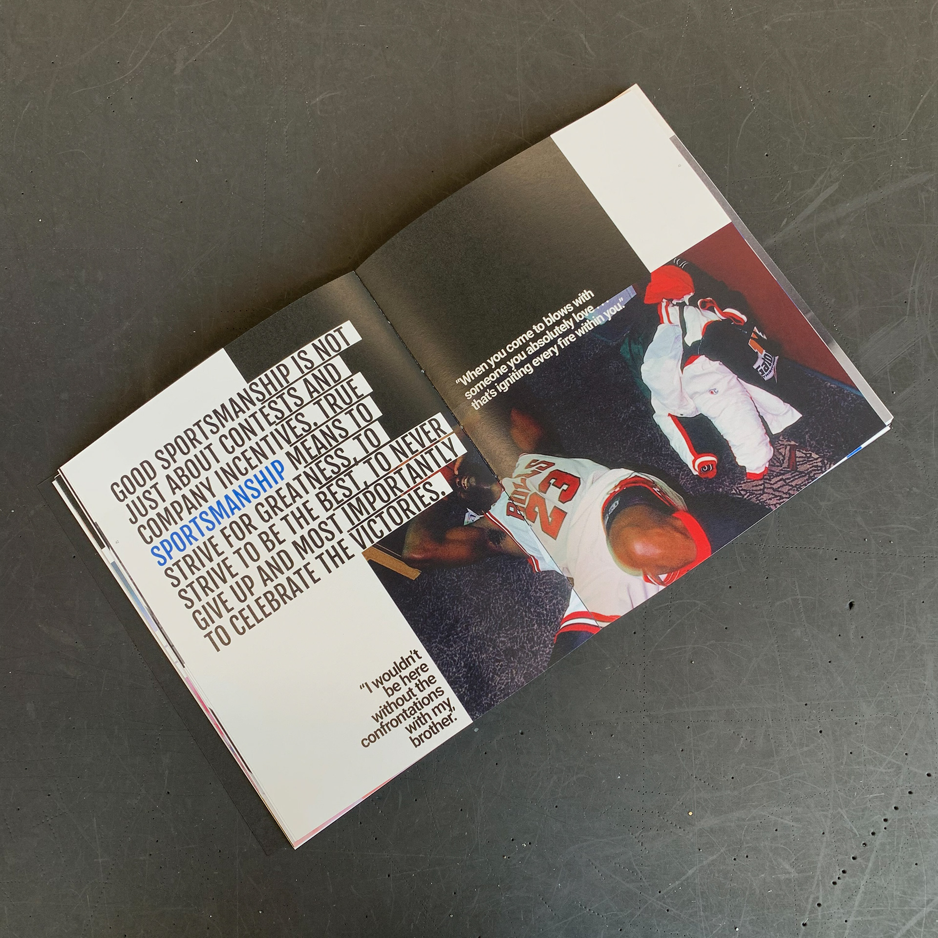
BRAND VALUES
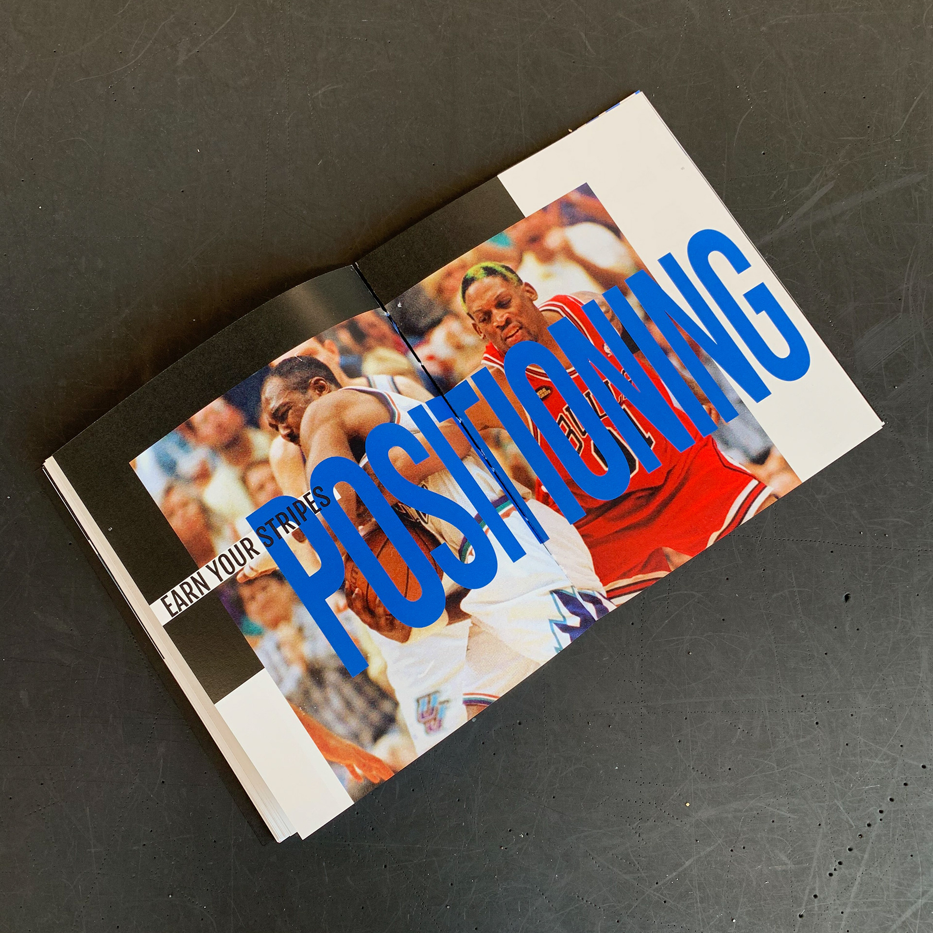
CHAPTER ON POSITIONING
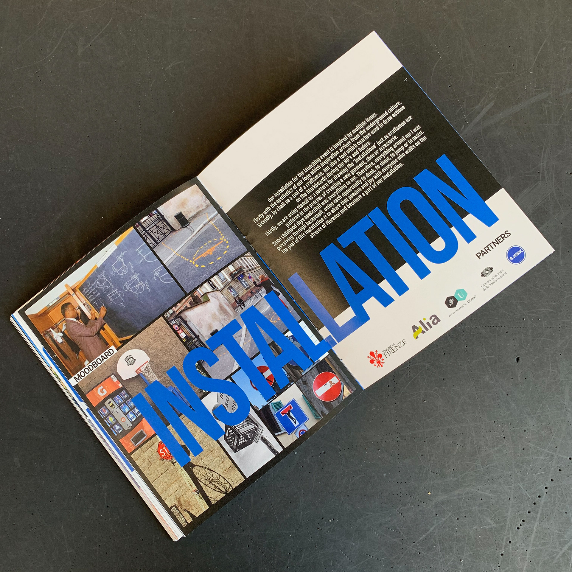
LAUNCHING EVENT INSTALLATION INSPIRATION
PROJECT MOODBOARD